We may earn revenue from the products available on this page and participate in affiliate programs. Learn more ›
Think of the new 13-inch M4 iPad Pro like you would a race car. They’re both full of fancy new performance-maxing technologies that will one day trickle down into more affordable and consumer-friendly models. They’re also both aimed at experienced users who know how to get the most out of powerful hardware. And, despite all of that, they’re both really fun to have, even if you’re not all that advanced or talented.

Specs
Computing hardware: M4 chip
Screen size: 13 inches (also available in 11 inches, but we have not reviewed that model)
Screen resolution: 2752 x 2064
Display type: OLED (Ultra Retina XDR)
Wireless: eSim and Wi-Fi 6E
Storage options: 256GB, 512GB, 1TB, 2TB
Camera: Wide-angle f/1.8 camera
Bluetooth: Version 5.3
Weight: 1.28 pounds
Dimensions: 11.09” x 0.2” x 8.48”
Pros
Absurdly beautiful screen with fantastic contrast and impressive brightness
Super-thin design really does feel like a sheet of glass
M4 chip will be relevant for years—it’s not even available in Macs yet
Takes advantage of Final Cut Pro and Logic rebuilds
Heavy emphasis on powering AI-enabled features, which are becoming more common
Apple Pencil Pro introduces some cool new features like hover and squeeze
Front-facing camera now sits on top of the screen horizontally, which is much better for video calls
Anti-glare surface available for pros who really need it
Cons
Expensive
Magic Keyboard makes it even more expensive
Apple Pencil Pro is great but makes it even more expensive
No more ultra-wide camera
Verdict: The 13-inch M4 iPad Pro brings with it an innovative new display and a chip so new that full-blown Macs don’t even have access to it yet. Apple has put a clear emphasis on AI performance, and with the annual Worldwide Developers Conference looming, I fully expect the company to announce a ton of new features that take advantage of that advanced Neural Engine. It has tons of potential. For now, however, the iPad Pro is a capable tool for advanced users and beautiful, lust-worthy overkill for the rest of us.
The M4 iPad Pro’s design
 Stan Horaczek
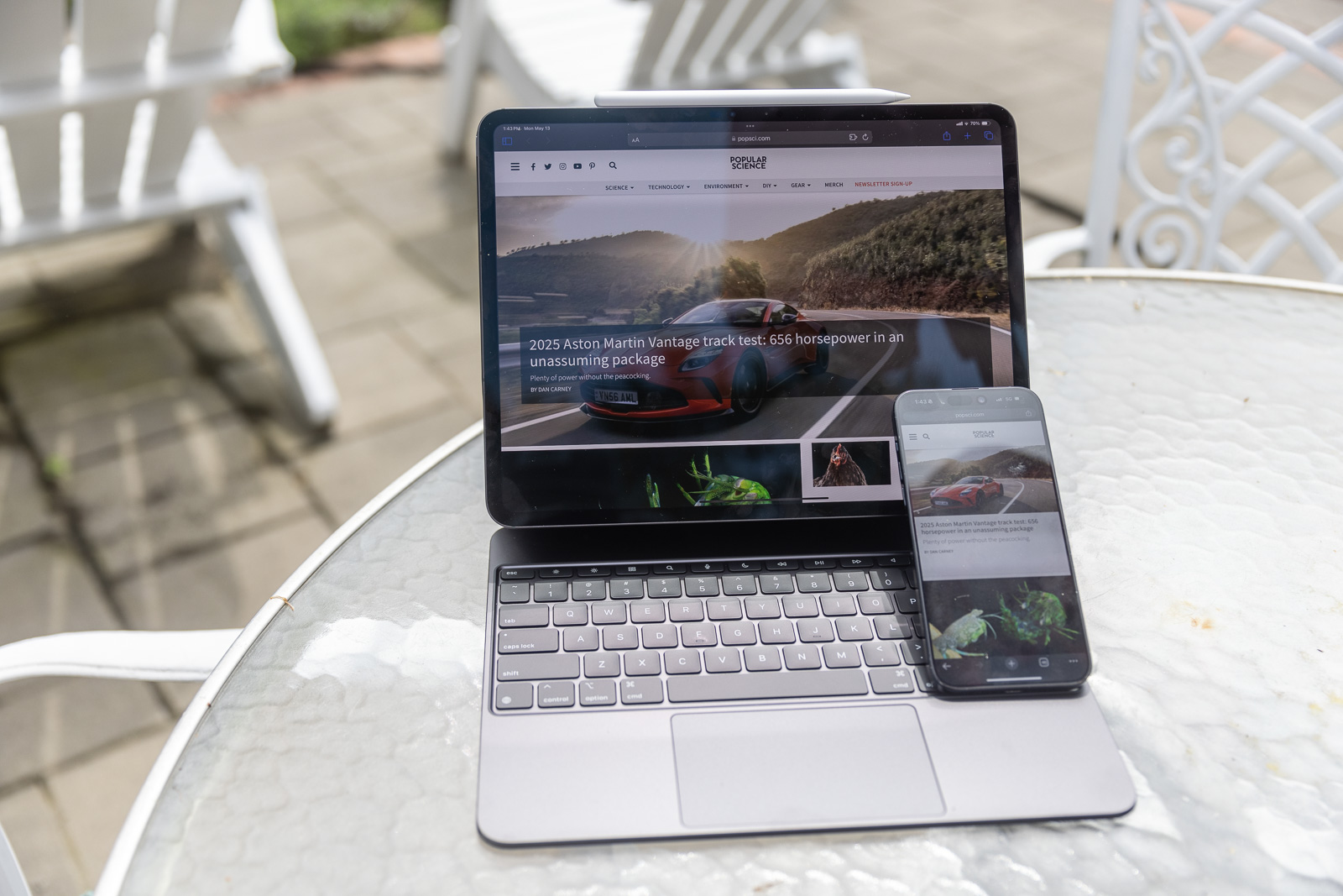
Apple has always envisioned the iPad as a magic sheet of glass that acts as a window to your content and apps. The new iPad Pro maintains the same basic screen size as its 12.9-inch predecessor, but at 1.28 pounds and just 0.2 inches (or 5.1mm to make things even more dramatic), the new model is both lighter and thinner. In fact, the 2024 iPad Pro feels a little absurd when you pick it up. A quarter pound may not sound like a big weight difference, but it’s a tangible change from the previous model. The Pro is even thinner and lighter than the new 13-inch iPad Air. It’s airier than the Air. Go figure.
You won’t find a SIM card tray since the new iPad Pro is eSIM-only. The power button remains on the top right corner of the device when held vertically, but the front-facing camera has moved to the right side—the top when held in landscape mode. This makes video calls look much more natural since users don’t have to look awkwardly over to the side to look at the camera. In fact, when the iPad Pro is in the new Magic Keyboard, it feels more like a laptop than any iPad has in the past. More on that later.
 Stan Horaczek
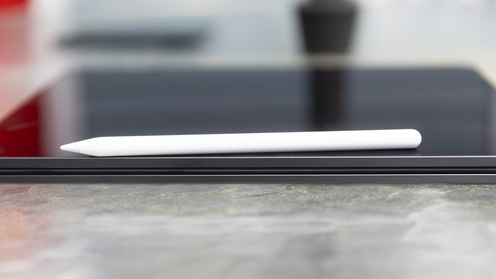
Ultimately, the iPad Pro is beautiful, but it takes some getting used to. It’s skinny. In fact, it’s skinnier than an old iPod Nano, which sounds a little absurd when we’re talking about a $1,300 (minimum) device. It has only been a week or so since I started testing the device, but I do wonder if that super-thin design will affect durability. I’ve thrown it in my backpack, dropped it off my desk while in the Magic Keyboard case (thanks, dog), and set a heavy camera rig on top of it with no signs of wear. How will it look after months of hard use? Only time will tell.
Display
Apple enthusiasts have been awaiting the OLED iPad for years. The previous model relied on a stop-gap Mini-LED display, which was excellent but couldn’t quite match the cache that comes with OLED.
The new Ultra Retina XDR display attempts to address some of the inherent limitations of an OLED screen. The primary challenge is brightness. To match the lumen output achieved by other display types, Apple layered a pair of OLED panels on its display. The result is a very bright screen that reaches the same 1,000 nits of full-screen brightness found in the previous model. That peak brightness cranks all the way up to 1,600 nits with HDR content.
 Stan Horaczek
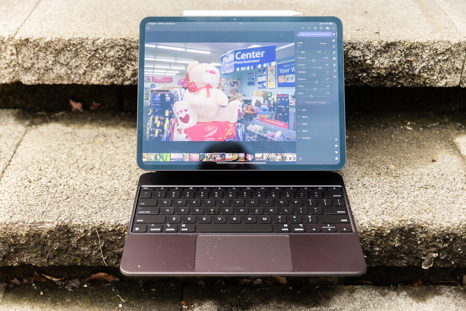
Those numbers can be hard to visualize, but it’s safe to call the screen very bright. In a darkened room, the maximum brightness setting is actually a little painful at first. It’s too much light. If you’re working in an area with lots of ambient illumination, however, that extra brightness really comes in handy. I spent a particularly bright Upstate New York afternoon working from the iPad Pro on my patio. I had no trouble seeing the on-screen image until I put it in direct sunlight so bright that no screen could compete. If glare victimizes you often, you can now opt for the $100 anti-glare surface treatment also found in the Studio Display. That’s probably overkill for most folks, especially since it could change the feel of drawing with the Apple Pencil.
OLED displays are emissive, meaning the pixels give off their own light. They can turn off completely when they don’t need to provide illumination. That keeps the shadows looking dark and boosts the contrast ratio all the way to 2 million, up from 1 million in the previous iPad Pro.
The screen covers the entire P3 color space and, after some eyeball-based comparisons, the colors and brightness look remarkably similar to the calibrated desktop monitor I use for photo and video editing. I showed some photography clients (who are also personal friends) images on a few different iPads and MacBooks. They both agreed that the images looked best on the new iPad by a noticeable margin, even without knowing anything about the underlying tech.
I’m curious to see if the OLED suffers any of the other pitfalls that come with that display tech. I think it makes fingerprints more noticeable, especially when the content on-screen is dark. And I hope Apple has fully solved the burn-in issue, which used to affect older OLED displays. If objects stayed in the same place on-screen long enough, they would leave a semi-permanent ghost image that could be seen all the time. I don’t expect this to come into play, but if you keep a single app on-screen all the time, it’s worth at least considering.
Speed and performance
The iPad Pro is the only place to get a taste of the M4 chip; it hasn’t even made its way into full-blown Macs yet. While testing, I edited a large batch of Canon R5 raw files in Lightroom CC and fully edited several short-form social videos in Final Cut Pro for iPad. I also cleaned up some voice-over audio and went through my daily work routine, for which I usually use a MacBook Pro. I ran some benchmarking tests on the iPad Pro, but I’m not publishing those results publicly as they’re outside the scope of my recommendations, and there are lots of other sites that meticulously provide numbers like that.
When it comes to editing photos, the M4 has absolutely no problem, even with the R5’s uncompressed 45-megapixel raw images. Previews render instantly, adjustment sliders move without a stutter, and exports happen quickly. It feels a lot like editing on my M3 Max MacBook Pro. Though, this is where iPadOS gets in the way. I prefer Lightroom Classic because it offers way more granular features, but that’s not an option on the iPad.
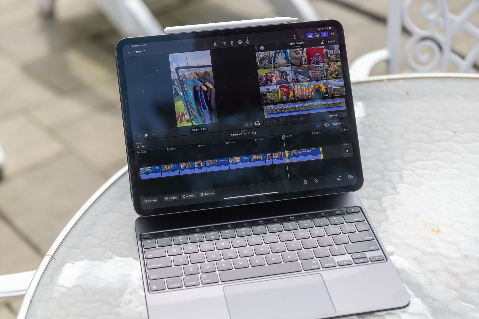
Firing up iMovie showed similarly speedy results. I recorded Apple ProRes footage on my iPhone 15 Pro Max, which is absolutely overkill for the TikTok videos and Instagram Reels I was working on. But I wanted to see how the iPad Pro handled the files. Predictably, it didn’t have any issues. Touch-based editing still feels a little foreign to me after so many years with a mouse and keyboard, but learning gets a lot easier when the hardware doesn’t choke on big video files.
I always try to use 3D modeling software during these tests even though my skills range somewhere between pathetic and “bro, just stop.” While I may not be able to whip up a Pixar character, I can tell how responsive a device is when working in SketchUp. I could easily rotate and render my lumpy triangles without hiccups. If you plan to do any 3D rendering work on an iPad, this is very clearly your pick.
New iPad accessories
You could buy the bare base 13-inch iPad Pro M4 for $1,299, but you’d miss out on some of its key functionality. Apple also released a pair of basically essential accessories to go with it.
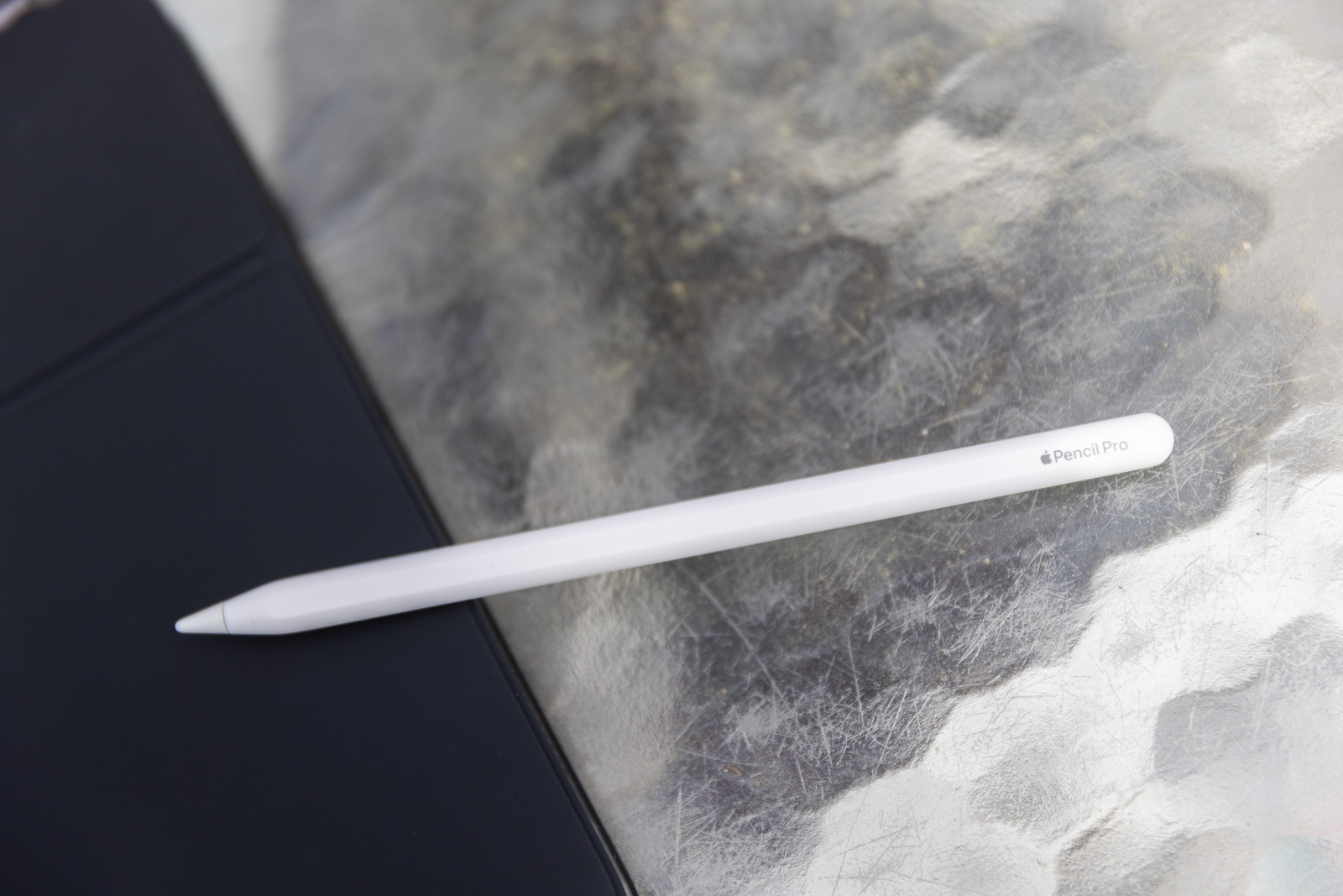
The Apple Pencil Pro
 Stan Horaczek
The new $129 Apple Pencil Pro only works with the new M4-powered iPad Pro and the M2-powered iPad Air. But, if you’re willing to shell out the extra cash, it does offer some rather clever new features. The biggest upgrade comes in the form of a built-in gyroscope so the pen can tell when you rotate it. So, if you’re using a marker with a chisel-shaped tip, you can rotate it as you draw to change the diameter of the line. It feels incredibly intuitive. Apple Pencil Pro also introduces a new hover feature, which creates a small on-screen shadow before the Pencil even touches the display to show you what your stroke will look like. I still suck at drawing in every regard, but I can absolutely see how actually talented people would use this. It requires almost no learning curve.
The other notable addition comes in the form of a squeeze feature. I always found the tap feature somewhat cumbersome on the Apple Pencil 2. Now, you can simply squeeze the Pencil to bring up brush options or perform other assigned functions. Like the rotations, this feels like a totally natural process. Overall, this feels like a worthy upgrade.
The Apple Magic Keyboard
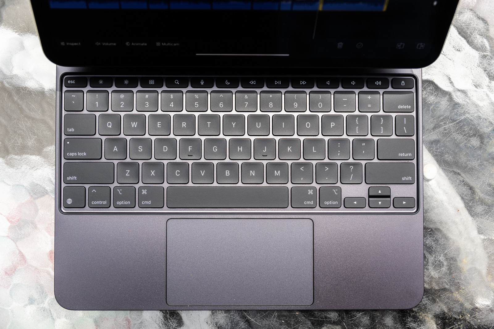
Take a moment to digest the new Magic Keyboard’s $349 price tag. Yes, that’s a lot. In fact, it’s basically the same price as the base-model iPad (10th gen.) at this point. Now that you’ve come to terms with the cost, we can get into the performance. The Magic Keyboard case essentially turns the iPad Pro into a 13-inch touchscreen laptop. The new model maintains the same basic form factor from a mounting standpoint, but the keyboard piece has changed. Most importantly, you now get a full row of function keys, making it simple to adjust things like brightness and volume without digging into the on-screen menus. Great upgrade there.
The Magic Keyboard still has a single USB-C port on the left side that provides pass-through charging but not data. That leaves the iPad’s Thunderbolt port free to connect accessories like storage or input devices. I appreciate the keyboard’s aluminum body because it reinforces the iPad itself to protect it from getting crushed in my bag.
Overall, the Magic Keyboard is great at what it does, but it locks you into a laptop-like format. You can’t simply flip the keyboard around like you can with the Folio cases and use the iPad like a tablet. You have to take the iPad all the way out of the Magic Keyboard case if you want that pure tablet form factor. That still feels weird to me.
So, who should buy the iPad Pro (2024)?
Right now, the new M4 iPad Pro is full of potential. Apple has talked ad nauseam about how much computing power this new chip devotes specifically to AI-powered features. Right now, that feels like an untapped resource, but in June at WWDC, Apple will likely unveil the next version of iPadOS, and with this beast on the market, I fully expect a whole cadre of new AI-centric features. What will they be? We’ll have to wait and find out.
Right now, if you’re using an M2 iPad Pro, you shouldn’t feel rushed to upgrade. The OLED is beautiful, but the Mini-LED was no slouch. In many situations, you probably couldn’t tell the difference between the two, even sitting side-by-side. And when it comes to processing power, the M4 chip is faster in every way, but we won’t know how big the difference is until we start seeing more AI-dependent features hit the OS.
However, the M4 iPad Pro will feel like a huge jump if you’re coming from an older iPad. The whole package feels very polished and sophisticated. The screen is beautiful, and everything runs smoothly. And the gap will only widen with every new OS update.
If you are going to jump into the iPad Pro (2024), make sure you consider the spec differences that come with the different storage options. The 256GB and 512GB models offer lower specs across the board than the 1TB and up models. If you want the most power, you’re going to need to go up to at least 1TB (and pay at least $1,899 for the Wi-Fi-only standard glass version). The higher-end M4 models offer one extra CPU core and twice as much shared memory (basically equivalent to RAM in Apple M-series chips and not something you can upgrade after purchase). If you’re going to make the leap into an expensive device like this, you might as well make it as future-proof as possible.
>>> Read full article>>>
Copyright for syndicated content belongs to the linked Source : Popular Science – https://www.popsci.com/gear/apple-m4-ipad-pro-2024-review/


