Interview with Kevie Murphy
Photography by Michael Partenio
Kevie Murphy is the founder and principal designer of k.a. murphy interiors, a high-end residential interior design firm in New York City and Long Island.
Here she shares her inspiration and process for restoring her twentieth-century home.
How did you get started in interior design?
My husband and I purchased a Brooklyn Heights co-op that required extensive renovations. As the project unfolded, I realized how much I loved the process of redesigning and reconstructing it. So, in 2014, I enrolled in the New York School of Interior Design to embark on a new and exciting career. Shortly after, I was involved in several parent groups in New York City and started to receive referrals from them. In 2017, I finally got my first paying client and my business began growing exponentially. Since then, I’ve hired three full-time employees and two contractors.

What led you to purchase your current home?
We decided to move back to Long Island in 2015 because we were outgrowing our home in Brooklyn Heights and needed more space. We were lucky enough to find Elderfields Road, a 1940s home located in the Flower Hill neighborhood of Manhasset, Long Island. It is situated on a one-acre corner lot, is 7,200 square feet, and has six bedrooms and ten bathrooms. The home needed a gut renovation due to extensive water damage and a collapsed ceiling, among other issues, but we knew that the bones of the house were just fine. Its charm and character were bar none, and it provided the space we needed for our large family—all four kids would be able to have their own rooms. It took nine months to restore and renovate it before we could finally take residence.
What structural renovations did you make?
We did not expand the size of our home since 90 percent of the walls remained intact, but we needed to remove the original plaster to replace all of its operational systems. Our goal was to work with what we had by keeping the home’s overall footprint and original character while bringing in the comforts of the twenty-first century. However, we completely redesigned the kitchen and mudroom, we well as the conservatory ceiling in our family room to give it a dramatic, domed look.
How would you define your style for this project?
My overall goal was to integrate traditional and modern decor. Every area of the home was thoughtfully designed with its own unique character by incorporating bold colors and warm neutrals and interspersing fun, colorful fabrics throughout. For example, I set the tone and color palette of the foyer by adding eclectic fuchsia-and-turquoise-colored wallpaper that complemented the winding staircase, black-and-white diamond-tiled flooring, ceiling molding, and a Persian-inspired Pierre Frey wallpaper with jade-toned animal and bloom motifs throughout. This paper dictated the color palette for all of the surrounding rooms. I incorporated these colors with antiques and traditional chesterfield sofas to retain the home’s old-world charm.

What was your vision for the conservatory?
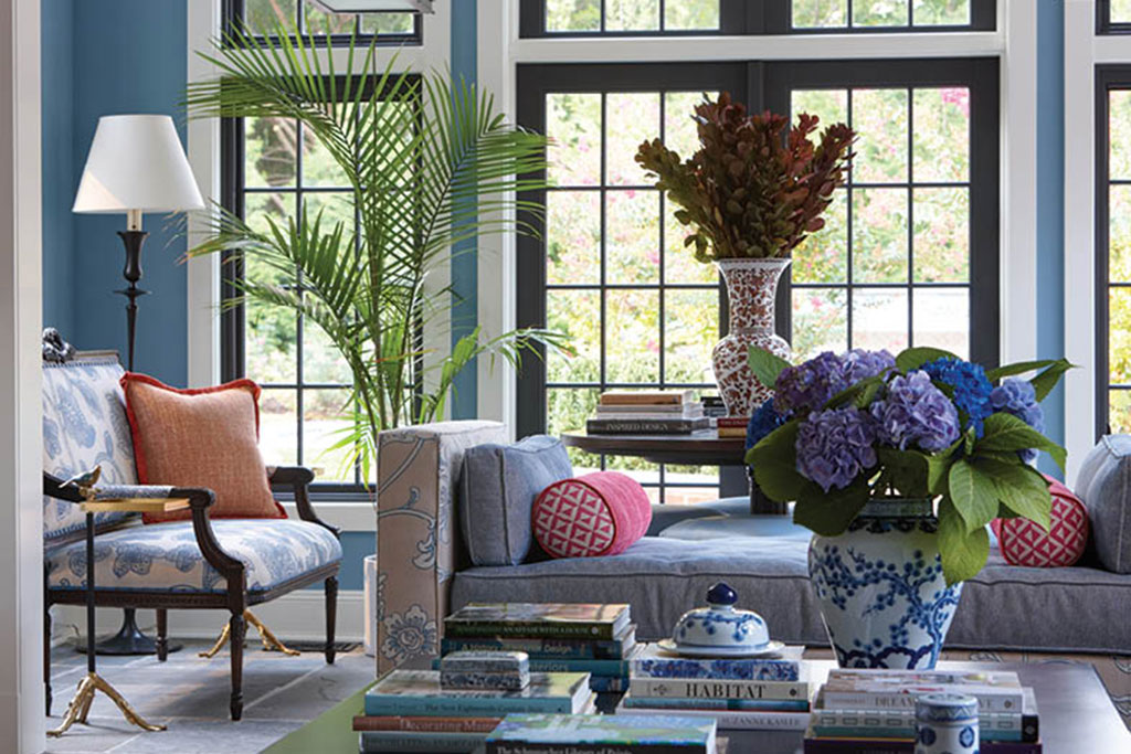
My vision was to construct a space where the whole family could comfortably congregate to watch movies, spend random Saturday nights hanging out, and celebrate birthdays, holidays, and other important events. I began the redesign by replacing the flatwood-beamed ceiling with a dome, which added light to the room, giving it a more dramatic effect. There are also lots of windows overlooking the backyard, which contribute to the room’s natural light. I used satin paint on the walls to give them a plastered appearance and swirled the paint to create a vintage look.
The parlor is a beautiful, colorful room. How did you decide on the colors and design?
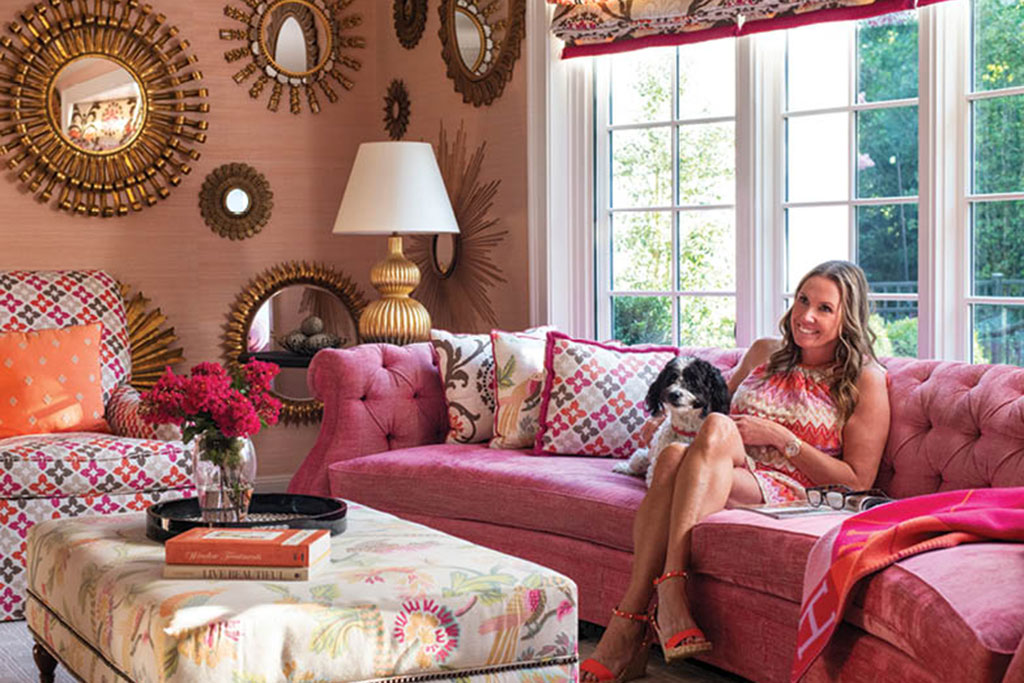
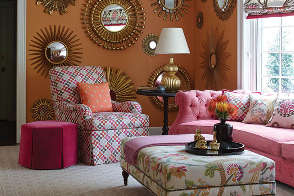
My inspiration for the parlor came from the pink and orange colors of the chinoiserie wallpaper in my foyer. I wanted it to be colorful, bright, and a comfortable place to relax. It was a challenging renovation due to its narrow, shallow shape; we ended up removing the chimney. We also had to account for the bow window when designing the room’s layout. I started by placing a traditional chesterfield sofa custom made to fit in front of it, spicing it up by using crushed pink velvet upholstery. I then added a colorful swivel chair, a large ottoman, and throw pillows to tie in with the foyer’s theme. Also, by hanging several gold mirrors on the parlor wallsI even painted some gold to enhance their color—it created a fun, eye-catching focal point for the room.
How did you transition this theme into the dining room?
I always wanted to create a blowout formal dining room using wallpaper from Gracie Studio, a New York-based company that manufactures hand-painted chinoiserie wallpaper. I chose one that has a gold metallic effect; coupled with the neutral paint colors, it gives off a subtle yet dramatic, elegant tone. It was a great way to transition from the bold colors and decor in the adjoining foyer and parlor. I also added a rustic, hardwood-painted table, complemented by big, comfy chairs with leather seats and taupe-and-beige silk patterned fabric on the back to tie in with the other neutral colors.

You’ve said that a living room defines a person’s style. How does it define yours?
The living room is a great space to try new things, and I believe it should set the tone for the rest of the home. In ours, I focused on English architecture with medallion plaster reliefs on the ceiling and new molding and paneling. I also used modern lighting, which added a nice contrast to the more traditional decor. Finally, I incorporated bright colors and statement pieces to really elevate the space.
Your motto is “Home is your memory maker.” How did you incorporate it into this project?
A home should be where a lifetime of memories are made—a safe space where you share life events and feel loved and comforted. It’s where you surround yourself with family heirlooms, family photos, and travel memorabilia. For instance, I saved my kids’ baby bathing suits and mounted them in shadow boxes so I could cherish them forever.
What are your top three design tips?
First, make sure that the seating in your family room is as open and conversational as possible. The goal is to create an inclusive atmosphere that is conducive to family and social get-togethers. Also, do not sleep on wallpaper. It’s a fantastic component to any room design—it’s better than paint. The effect wallpaper has will be transformational. Finally, don’t underestimate the importance of throw pillows. Everyone loves a colorful, comfortable throw pillow.
For more info, visit kamurphyinteriors.com
>>> Read full article>>>
Copyright for syndicated content belongs to the linked Source : AmericanLifestyleMag – https://americanlifestylemag.com/decor/interior-design/a-1940s-home-restoration/


