Arcade-style aerial combat games have been thin on the ground in recent years, with the notable exception of Bandai Namco’s Ace Combat 7: Skies Unknown. This 2019 high-altitude genre revival gave us a high-quality jet combat game, built for modern visual expectations with the help of Unreal Engine 4.
Now, with little build-up or fanfare, Bandai Namco has dropped a Switch conversion, which promises the full Ace Combat experience at home or on the go. How well has this graphically sophisticated title been translated to the Nintendo Switch?
A quick glance at the Switch and Xbox One versions side-by-side reveals few obvious compromises on Switch relative to the game on last-gen consoles. But if you go a little deeper, there are some key differences that separate the two releases – even if in typical gameplay some of those changes aren’t terribly evident.
Ace Combat 7 was a graphically impressive 2019 release for last-gen consoles and PC, so does it survive the translation to more modest Switch hardware?Watch on YouTube
Perhaps the clearest compromise comes down to the presentation of foliage elements. At a significant height, the forests are only represented using flat texture art on Switch, while the Xbox One has proper alpha-textured foliage instead. The foliage visibly protrudes over the Earth’s surface, and is shadow-casting as well.
We have to get closer to the ground before we start to see the same trees and shrubs on Switch – but again there’s a catch. The draw distance for foliage elements is pulled in dramatically on Switch, producing much more obvious pop-in than we see on Xbox One. Plus, density takes a hit as well, even at close range. Trees are less numerous on Switch, and the grass is patchier.
Interestingly, this doesn’t appear to apply to buildings in quite the same manner. Structures pop in at around the same distance across both machines, and generally the density and draw distance is similar. In more dense city areas though, the draw distances were pulled in considerably on Switch for most building models, suggesting this may be tweaked on an object-by-object basis to reduce load.
There are some lighting tweaks on Switch as well, which can be obvious in side-by-side comparisons. The Switch loses screen-space reflections (SSR) for instance, with water surfaces instead reflecting a basic impression of the sky color. In practice, though, I don’t think the SSR is working very well in this title, as the dark, featureless reflections it provides don’t always look more realistic. Plus, Ace Combat 7 lacks TAA, so the reflections tend to shimmer excessively frame-to-frame. Even though this is a downgrade on a feature level, I think the Switch actually looks better here.
Indirect lighting quality doesn’t fare quite as well, unfortunately. Ambient occlusion is a lot less obvious on Switch and may be absent, providing a less convincing impression of indirect shade. This is visible to some degree during gameplay, like in the shadowed regions of the some buildings, but it’s more obvious during cutscenes. When the geometrically complex bodies of the aircraft are highlighted, the results on Switch tend to appear less effectively grounded in the world. The cockpit view also tends to look somewhat flatter on Switch.
The game’s direct lighting tends to look fairly similar across both platforms, though. Shadow maps appear to have roughly the same resolution in cutscenes and gameplay alike, though shadow filtering has a slightly different appearance on Switch. Generally, shadows look more sharply defined on Nintendo’s platform, but suffer from more obvious aliasing as a result.
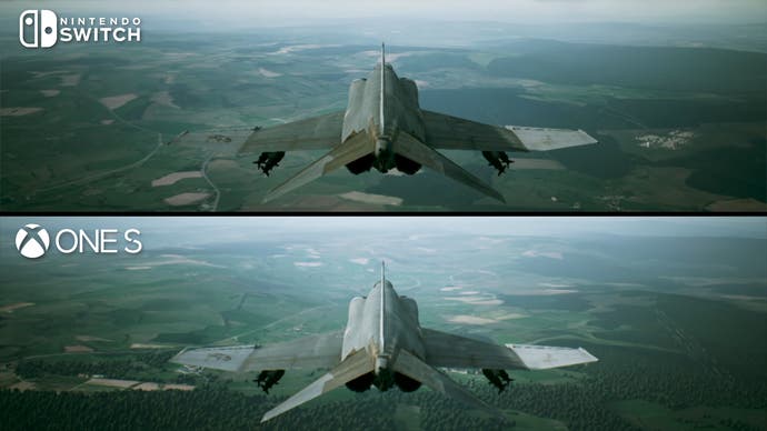
Foliage rendering is one of the few places Bandai Namco has made noticeable cutbacks on the Switch version versus the full-fat Xbox One S original. | Image credit: Digital Foundry
Ace Combat 7’s most striking visual characteristic has to be its clouds. Voxel-based and beautifully-lit cloud formation were developed using TrueSKY middleware and represent some of the absolute best clouds in gaming. They prove key to Ace Combat 7, as clouds scramble weapons systems and provide a sort of aerial cover for friends and foes alike. You can fly around and through clouds and they hold up very well from any angle or distance, and they cast diffuse shadows on the terrain below.
On Switch, the cloud simulation is surprisingly largely intact. At a glance, we appear to be getting the exact same volumetric cloud rendering that graces the other versions of the game, with similar lighting and structure. If you do look closely, the clouds do suffer from more obvious artefacts than on Xbox One, with slightly simpler formations that do have visible breakup. In typical play this isn’t that noticeable though, unless you’re specifically looking for it.
Similar effects, like smoke, appear to be made using sprites, as is often the case in modern games. These can have visibly reduced density on Switch, though the results look convincing enough regardless. The game’s dramatic fireballs look quite similar across both machines though. At point-blank range you can tell that the images on Switch are lower resolution, but at a typical distance they look just about identical.
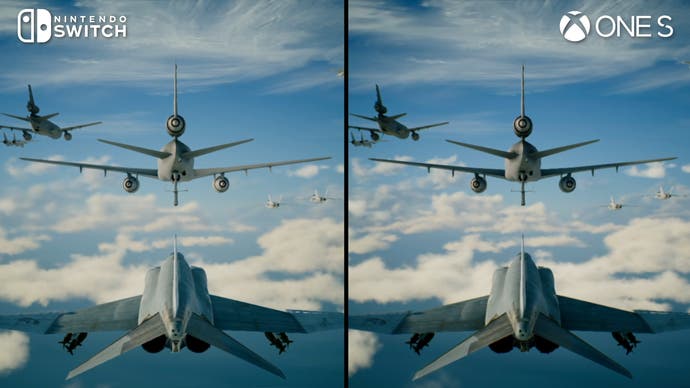
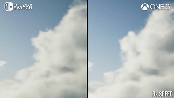
The game’s impressive cloud rendering is surprisingly intact on Switch, with only marginally more artefacting visible on the new release. | Image credit: Digital Foundry
Post-processing has also been downgraded slightly for Nintendo’s hybrid console. Motion blur is present on Xbox, both of the camera and per-object varieties, but the technique is totally absent from the Switch release. I do think it adds a certain filmic quality to the Xbox One version, though cutting it probably frees up an appreciable amount of GPU time for Switch. The depth of field blur looks pretty similar across Xbox and Switch here in cutscenes, though it does look a bit more refined on pause screens on Xbox, with a visible focal point where the image is sharper.
There are a few other post-process tweaks across both versions. Chromatic aberration is present on Xbox – and can’t be turned off – while the Switch lacks this technique and the colour fringing it causes. Both versions of the game have a bit of vignetting in the corners of the screen, but the effect seems slightly stronger on Xbox. Both consoles do feature film grain, however, which appears the same on both platforms – and again, this can’t be turned off.
The Switch has about half the usable RAM of the Xbox One, so I came in expecting to see some reduction in texture quality on Nintendo’s hybrid console. Surprisingly, it was very challenging to spot any substantial reductions in the resolution of 2D art across the two consoles. In cutscenes, sometimes you can spot one or two isolated elements that are obviously lower-res on Switch, but generally the two consoles correspond closely with one another.
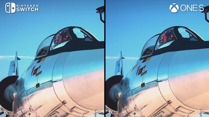
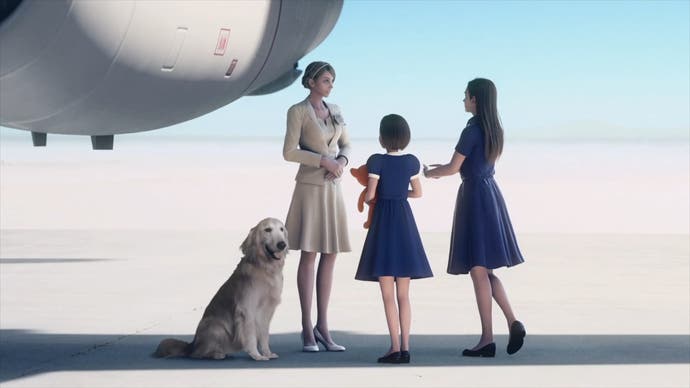
Despite having a significantly smaller install footprint, the Switch version seems to have similarly high-quality prerendered cutscenes, most of which hold up well in 2024 – though some shots that combine CG with real-world photographs (the dog) can be a bit distracting. | Image credit: Digital Foundry
That’s a pretty long list of concessions on Switch, but in actual gameplay they don’t really stick out much at all. Without a side-by-side comparison, the only downgrade that’s really noticeable is the difference in foliage rendering, which produce a visibly less detailed and less convincing world on certain maps. In typical play though – especially when flying at a decent height – it can take some effort to distinguish the two consoles from a visual perspective.
Beyond the rendering, I took a look at the game’s pre-rendered cutscenes to see if the Switch version had taken a quality hit. The Switch code is just 14GB – about a third the size of the Xbox One release – so I did expect to see some reduction here. In side-by-sides though they do appear very similar, without much difference in detail resolved or compression artefacts.
As an aside, these CGI scenes probably haven’t held up quite as well as the in-game graphics. The actual visual fidelity of these sequences still impresses, but it seems like the production budget wasn’t quite there for the kind of film-level CGI we see from the likes of Square-Enix. These scenes tend to have very limited animation and often consist of camera pans with largely idle human characters. Sometimes the scenes make use of real-life photographs as well, which don’t always blend nicely with the 3D computer graphics.
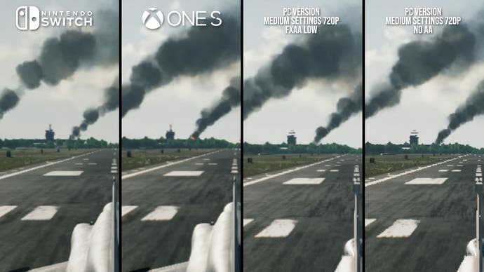
Looking at the PC version, it looks like both Xbox One S and Switch use anti-aliasing, but coverage is none too impressive. | Image credit: Digital Foundry
In terms of image quality, Ace Combat on Switch doesn’t acquit itself terribly well, but it’s basically the same setup as Xbox One. Both platforms operate at 720p, and do have a fair number of raw edges in the presentation. Comparisons with the PC version do suggest that a post-process AA is in use, but its coverage isn’t very good. I’ve seen far worse in other Switch ports of eighth-gen home console games though, so a gently treated 720p image is decent enough. Dynamic resolution is hard to definitively rule out, but I didn’t see any evidence of it in my testing.
Interestingly though, the UI on Switch appears quite a bit cleaner than the UI on Xbox One, suggesting a higher rendering resolution. I was able to count the Switch UI at 1080p, so I’d guess the Xbox One UI may be at 720p here.
Portable mode takes a haircut down to 504p for the 3D, though the UI appears to be at 720p. It’s obviously not native res, but I think it looks basically fine for the most part. There is some extra breakup in the clouds and the shadows are visibly lower resolution, though elsewhere I believe visual settings are matched or are close to matched between docked and portable play.
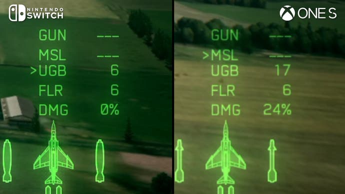
Surprisingly, the UI on Switch is noticeably sharper than on Xbox One S – potentially 1080p in docked mode versus 720p. | Image credit: Digital Foundry
Performance-wise, the Switch version targets 30fps. Throughout my hours of play, I really struggled to actually log a frame-rate drop, even when I flew through large explosions and through large city areas. One of the few times I can recall seeing a drop was when my plane collided with a building, producing a screen completely filled with alpha effects. This obviously doesn’t reflect a realistic gameplay scenario, so I think in typical play performance should be just about faultless on Switch. By eye, I couldn’t spot frame-rate dips in portable play either, suggesting a very good performance return there as well.
The One S comparison is interesting too. Bandai Namco elected to go for a 60fps target on last-gen home consoles, including the One S. But the actual recorded performance level is often quite a bit shy of the mark. When flying through more complex areas, like a city in the fourth mission, we see sustained frame-rate dips to the 40s and 50s, with occasional incursions into the upper 30s. It’s a very unstable performance level in typical play.
Some missions and scenarios do run better, namely when the ground detail is less complex. But despite the potential to hit that 60fps target, we usually don’t get particularly close. I’d say the Switch’s overall frame-rate is very solid considering the hardware, and might even be preferable to the One S depending on your tolerance for variable frame-times.
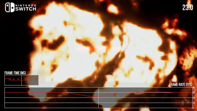
Throughout testing, the Switch version kept a locked 30fps throughout – with the lone exception being this full-on plane into building crash with screen-filling alpha effects, dropping the game to 23fps for a split-second. | Image credit: Digital Foundry
Ace Combat 7, in my mind, is up there with the cream of the crop of Nintendo Switch ports. The core visual experience has been capably translated to run on Switch at a stable performance level, with various nips and tucks but nothing that fundamentally compromises the experience. Put head to head with much more powerful Xbox One hardware, it manages to hold its own in a variety of gameplay scenarios. Plus, the pre-rendered videos aren’t overly compressed and the game even manages to throw in a clean 1080p UI for good measure – a feature absent on the Xbox.
It feels like a solid port and a game that must have needed a lot of work to get it to run this well on what is essentially 2015-era tablet hardware. Ace Combat 7 has some impressive visuals, especially its sky rendering systems, so translating it to run on Switch with relatively limited compromises is quite a feat, even if the game does arrive some five years after its home console counterparts.
To sum up, Ace Combat 7 comes highly recommended on Switch. It’s one of the very best ports we’ve ever tested on the soon-to-be-replaced hybrid system.
>>> Read full article>>>
Copyright for syndicated content belongs to the linked Source : EuroGamer – https://www.eurogamer.net/digitalfoundry-2024-ace-combat-7-is-one-of-the-most-impressive-switch-ports-weve-ever-tested


