This April, the War Robots project turns 10 years old. While a lot has changed over the years, our love for robots, combat mechs, exoskeletons, titanic fighting machines, and the like has remained the same. Just look at a snapshot of how many unique and cool robots and guns we’ve created during this time:
149 guns of an incredible assortment
Plus, a huge number of skins, remodels, modules, pilots, drones, ships, turrets, and “ultimate” versions of our content and maps
Hello! My name is Erik Paramonov, and I’m the Lead Game Designer at War Robots. In this article, I’ll share a retrospective look at how our approach to robot design has evolved.
Of course, beyond robot design, there are many other different content layers in the project, but it’s the robots that are the soul of the game – and I can share a lot about them. Further, the other game content is developed in parallel, and in many ways along a similar path. So, in any case, the development of robot design will present the most complete representation of this path. Let’s kick things off by talking about visual design.
Our approach to visual design: the beginnings
A long time ago, our project was actually called “Walking War Robots”. It’s a good thing that we eventually abandoned that first word because it would be really difficult to explain why our “walking robots” can now run, fly, levitate (and even teleport).
If you were to look up old documentation, ancient GDDs, and already forgotten drafts, you would find several simple commandments for War Robot’s visual design during those times. We’ve already moved away from some of those, but back then, the gist was this:
Our robots are gigantic – 10 to 20 meters tall.
Since they are so enormous, they are also slow; this is logical, considering that they weigh hundreds and thousands of tons.
Our robots are military machines, and this should be conveyed by every detail: starting with references to real-life military equipment in the design of the models and ending with the fact that it cannot be painted in bright, cheerful colors.
War Robots takes place in the near future: by this time, military equipment has become more powerful, and new resources and energy carriers have appeared. This makes it possible to manufacture huge robots as a convenient and effective combat unit.
That said, now, ten years later, we’ve since reconsidered each of these rules, and content design has long moved away from old approaches – for good reason.
Experimenting with style
In the beginning, we had some restrictions regarding the overall design of robots (militarism, references to military equipment, a tendency towards realism), now we just try to comply with the framework established by technical restrictions, plus certain stylistic guidelines.
In the design of our first robots, you can easily notice the outlines of real military equipment. For example, the Griffin robot is clearly inspired by the British HP.80 Victor bomber, and the Leo robot, in both name and appearance, is a clear reference to the German Leopard tank.
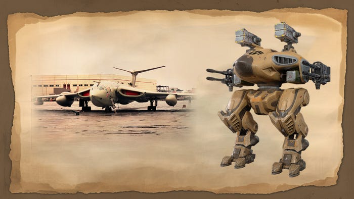
HP.80 Victor bomber and Griffin
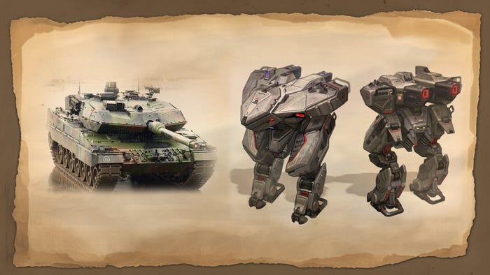
Leopard tank and Leo
Over time, we tried to move away from one particular style and look for something new. One of the first of these experiments was the “Knights of Camelot”: their body design already had anthropomorphic forms, but at the same time there were still touches of harsh militarism and realism.
Then, we gradually started trying new and completely non-standard solutions for the WR universe. Among these: experiments with color, body shapes, chassis types, both anthropomorphic and animalistic vibes, and the use of images from the culture and mythology of different regions and countries. Here are just a few examples of how robot design has changed over time:

These are the robots from 2016 to 2021. With just 4 examples, we see influences ranging from Battletech, to animalism, and even alien designs
Of course, you might wonder why we did all this and if we were concerned about losing our identity. After all, some players were probably attracted by the robots that look like military equipment in the first place – were they even going to be OK with these experiments? The answer is pretty simple: the design was adjusted to the gameplay, and was finally consolidated only after we saw that the players reacted positively, with growing metrics.
As time progressed, the new robots became faster and faster, and their abilities were much more complex than just jumping or activating a shield. The old design was rethought and adapted to the new gameplay, and the successful performance of these new robots (this success was measured by player interest and high marks within our in-studio content popularity charts) confirmed that we had chosen the right direction.
Maintaining our identity
As for the question of identity, our artists (and designers) do an excellent job of ensuring that, despite the uniqueness of each new piece of content, we maintain some kind of continuity. For example, in the picture below, there are robots from the same “family”, but which were created in different time periods; each looks unique, but still conveys some kind of relationship:
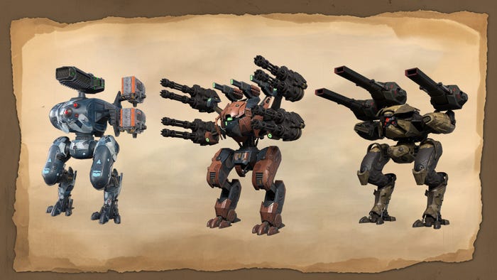
Cerberus (early 2020), Typhon (end of 2020) and Erebus (end of 2021)
Upon adding the “Pilots” feature to the game in 2019, the lore of the WR universe began to develop: factions appeared — five megacorporations competing with each other, and these factions also help us maintain a sense of identity with our robots. Each of them has its own history, degree of influence on the world and, most importantly, style.
We collected five different styles, integrated them into the WR universe and formulated a set of guidelines: with these, we can make robots of various styles, while at the same time, maintaining the overall WR identity. For example, while robots from the DSC faction may look different when compared to one another, players will not confuse them with machines from the EvoLife faction.
As a result, the game does not suffer from visual stagnation, and we can also please both fans of militaristic Battletech, Gundam, or Evangelion, as well as other robots and mechs from popular universes – all while maintaining the visual identity of War Robots.
Image, name and gameplay synergy
We also have to keep in mind the context that this image lives within: War Robots is primarily a mobile midcore shooter, and our target audience, for the most part, doesn’t like overly complicated mechanics – they also value their time: make the user wait too long, or introduce an entry threshold for content that is too high, and you’ll quickly lose retention.
The same goes for ease of navigation. The player must understand what content they see even before they start playing with it — this is exactly where the synergy of image, naming and gameplay comes in. If you see a snow-white robot called Seraph, with pointed and aggressive design elements on the body, large cannons on the shoulders and wings with jet engines on the back – it’s not difficult to assume that, at a minimum, this robot can fly and probably has an aggressive nature.
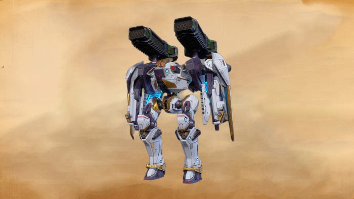
Seraph
Therefore, robot kinship can be clearly traced not only by their visual appearances (as demonstrated in the example above), but also by their names, and even their abilities. This is an important point that we always keep in mind when designing any piece of content: it seems obvious that image, abilities and naming should be in sync, but it is very easy to forget about it.
Further, selling an image is much easier than selling an idea. The latter still needs to be conveyed, explained and presented. But it’s enough to see the image, and the more holistic it is, the easier it is to interest the player with it.
As another note, over time, we have adopted the “Combo” system, kind of like a meal combo at a restaurant: this is when the robot always comes with the appropriate guns, a pilot and a drone. These additions not only support gameplay, they also perfectly complement the image. More on this a little later.
The general principles of interaction between art and design teams
We started with the fact that the art and game design departments were separate and interacted only as a performer with the customer. Game designers (GDs) prepared the documentation, collected references, finalized the image of the robot within the department, and transferred the documentation to the art department.
From there, the art department would read the documentation, prepare everything necessary for it, put the content through internal review, and after a few months, return to the game designers with a completely finished model with textures and animations. At this stage, the GDs could still ask to change something, but not radically, since the work was already considered completed.
This system was sorely lacking in flexibility, not to mention that closer collaboration between departments is always helpful. An idea or concept could be created by one person, then implemented by another, depending on workload – but this created inconsistencies.
Thus, over time we changed the pipeline. Now, each piece of content has its own GD, whose task is to work on this content from idea to release.
The first thing GD starts with is the concept; usually this is “cooked” within the GD department, but even at this stage the game designer begins to consult with the art department.
While the GD is thinking through the subtleties, a general description of the idea is transferred to the art department and work begins there. Throughout the process, everyone is constantly sharing their work with each other. Then, when the concept documentation is completed, the art department already has its own, which can be easily applied when writing full-fledged game design documentation (GDD). At this stage, the game designer tries to apply the ideas that the art department managed to translate in drafts.
After writing the GDD, the departments start interacting more closely – the GD and art department constantly discuss developments and create the final image of the content. Here is an example of the process of working on one of the content units:
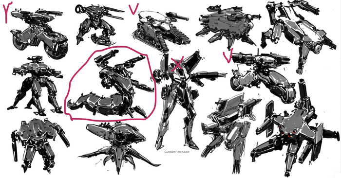
Stage 1. The art department generated ideas and forms, and GD identified the most interesting
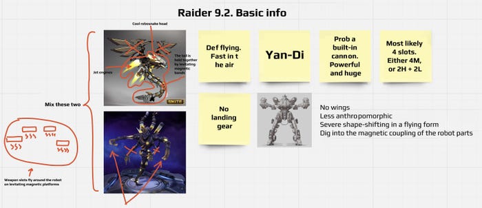
Stage 2. GD comes up with initial input on the robot for a specific release. We start thinking about how to adapt the image from stage 1 to our needs. We collect references and examples from other games
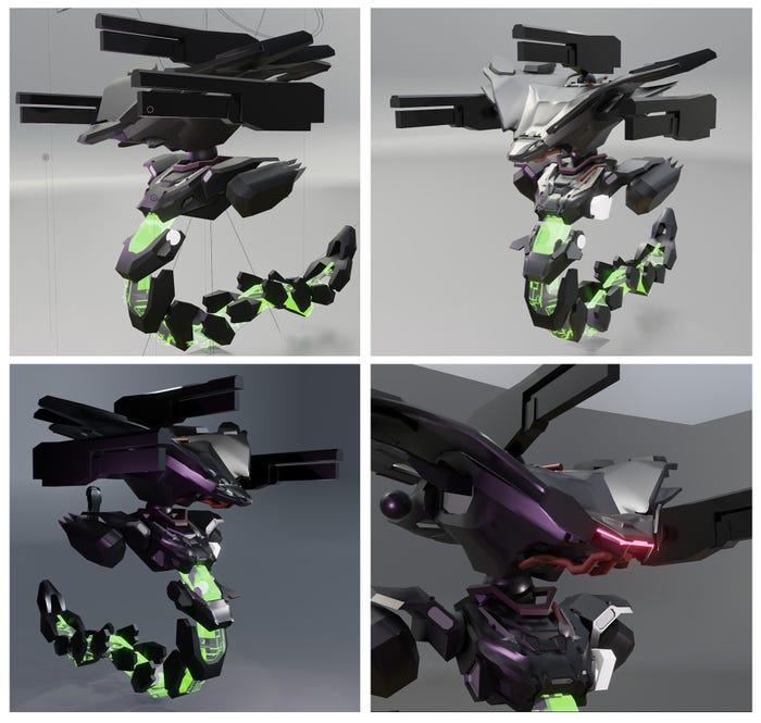
Stage 3. First draft model, taking into account all initial ideas
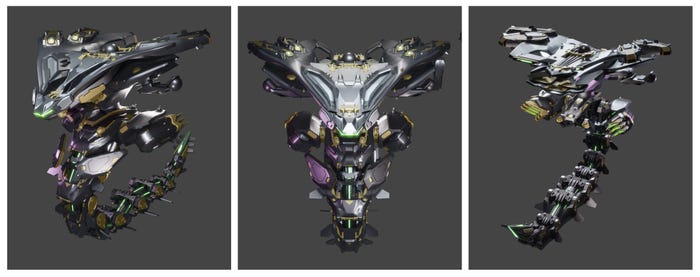
Stage 4. Finalization of the draft model
As a result, each department understands what the other departments expect from them, and the performers closely communicate with each other at every stage of development. As the GDs control the combination of image and gameplay, meanwhile, the art controls compliance with the style of the project.
With that let’s move on to gameplay design.
Gameplay design approaches: gameplay design for the sake of the image
Of course, we can’t talk about gameplay design without touching a bit more on the visual design, after all, the former was originally based on the latter. The first years of WR’s life were very dependent on the way the game was played. So, content was created, not so much out of a need for it, but out of a desire to embody a certain idea. In simple terms, not because we “needed” something, but because we “wanted” it. Was this bad? I don’t think so.
At the start of the project, when it was still being filled with content, and we were trying to find out what our players needed, we could experiment: in other words, we could afford to create content for the sake of the image itself. For example, once upon a time, we decided to create robots with references to the Wild West and cowboys. This is how Butch, Jesse and Doc appeared, all robots with Quick Draw, the ability to quickly change guns and which called to mind American military equipment in their design.
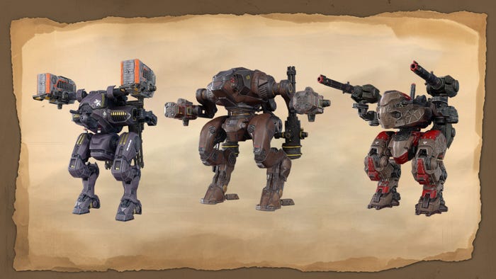
Doc, Jesse and Butch
But did these robots have a specific purpose? Why were they released in December 2016? Back then, these questions were not that important. We just needed to create interesting content to attract players — so these kinds of robots were an ideal choice for this task.
Why did I write that in the past tense? This is because, over time, the project has grown: it also became more difficult to operate and the goal was not only attracting players, but also retaining them.
It’s one thing to release a robot to an audience that hasn’t even tried half of what’s in the game yet. When the project is young, players are just getting acquainted with it. For the most part, they’re also experimenting with gameplay (like us), and looking for effective strategies and builds.
However, it’s a completely different thing to release content for veterans of the project, those who have been playing for several years and have tried everything previously released. Over time, we observed an increase of this “mature” audience. It’s no longer enough to just release “cool” content. It also has to be useful, and it has to come out at the right time, within the right niche, and complement the current meta. Otherwise, there won’t be demand, and resources will be wasted.
Structuring the gameplay design approach
When the project developed and gained popularity, it became clear that it was time to move to live operations (LiveOps), which meant we needed to standardize content production. Over the course of several years, we selected our ideal pace of content development, improved the tools to reduce the number of monotonous and repetitive tasks, looked for niches for each type of content, and built content relationships.
These were experimental times, a period of getting acquainted with your own project and the players who play it. Yet also, this was the point where we switched to a data-driven approach in content design: every decision needed to have statistical confirmation, and every hypothesis had to be tested by analytics.
We were faced with a difficult task: we needed to understand how much content, what type of content, and when we needed to release it in order to get maximum revenue, but at the same time we did not want overload ourselves (after all, human resources on this project does have a limit) and not bore the players with an excessive amount or complexity of content. We tested a variety of hypotheses, but let’s discuss the most notable of these.
Content level
From the very beginning of the project, our robots and guns were divided into unspoken tiers based on power. The problem was the secrecy and the free interpretation of power it allowed. How many tiers are there? What is the difference between them? There were no clear answers to these questions. As a result, we decided to divide all game content into four official tiers.
Tier 1 was intended to introduce a beginner to the game; this is the most simple content which allowed a player to master the basic gameplay.
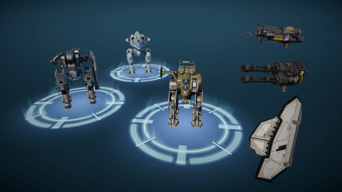
Tier 2 is for consolidating acquired skills. This was still easily accessible content that allowed you to get acquainted with similar mechanics as in the first tier, but with additional features and more power.
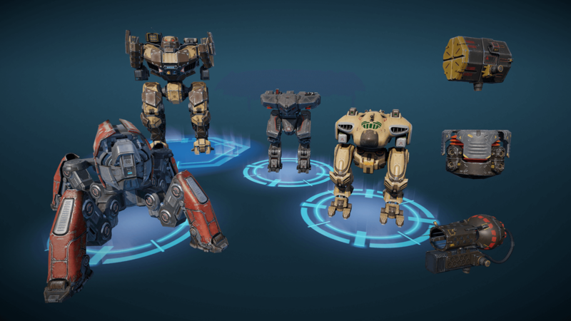
Tier 3 is intended to prepare players for more complex content, where things are not limited to simple mechanics. Entities like status effects, ability synergy, and non-standard movement appeared here. Access to the third tier was complicated, with the expectation that the player would need to farm and play content of a lower tier in order to move on to this one.
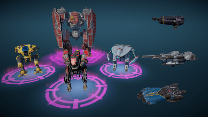
Tier 4 is the most complex, the most interesting and the most skill-demanding. All meta content with the most unusual mechanics is stored here.
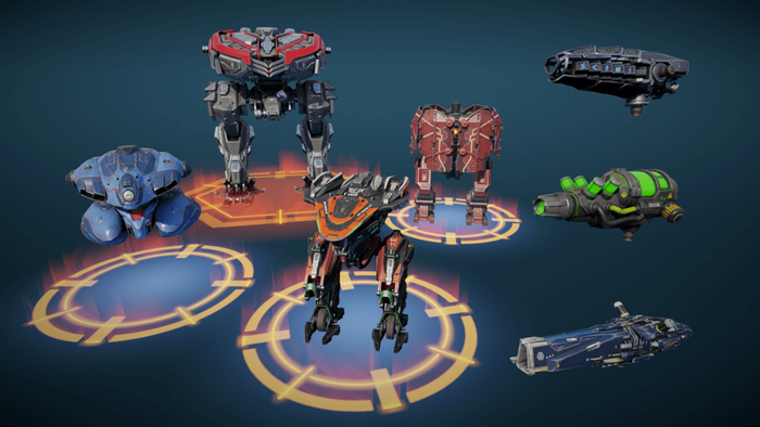
After we outlined the tier system, we were able to not only outline the scope of the content being released, but also we could understand the type of content we should release at all. Then came the time to experiment: we tried both to release content packs where robots of several tiers were released at once, and also to release robots of different tiers separately.
As a result, we realized that we did not need to force the player to play for a long time with low-tier content. It turned out to be much more profitable (and easier to make) the fourth shooting gallery more accessible so that anyone could get to it, and turn all the previous tiers into “training” ones. The final path for any player should be towards a fourth-tier robot.
This decision has led to the fact that we are now releasing only Tier 4 content. This makes balancing easier, and at the same time ensures that the player will (sooner or later) switch to high-tier content; so, the coverage of each new piece of content will be at maximum.
Content classification
Initially, the class system was also conditional. Robots were divided mainly by weight. There were only three weight categories, which differed from each other in the dimensions and weight of the weapons they carried. However, this system did not help us with content management, so we redid everything and re-classified the robots.
This all started with collecting statistics for each robot: average life time, average damage, modes and distances at which it was used more often, if there was a predisposition to capture objectives on the map. We then checked whether patterns were visible between robot characteristics and the statistics, and they were. As a result, our unspoken classification (DD, Tank, Support) was expanded to a more accurate one:
Sniper – robots with the highest life time, high damage, but low DPS due to mostly playing from cover distance and burst damage.
Brawler – front-lane robots that prefer melee builds. Lifetime ranges from “barged into the crowd and died” to “forced a fight on two or three enemies, waited for reinforcements, repaired, repeated.”
Glass Cannon – the highest DPS at medium range and average mobility.
Saboteur – the highest DPS at close range and high mobility.
Raider – a hybrid of the Saboteur and the Glass Cannon. It is balanced to perform best against the Titans. It always has a window of invulnerability, but outside of it, it is one of the easiest robots to kill.
Tank – the rarest class; the most convenient to play with Titans. A sort of walking fortress with a huge lifetime and high damage, but minimal mobility.
Support – a class with all average parameters, but balanced taking into account the fact that with its abilities during battle it strengthens its allies.
All of these took into account general patterns of stats and behavior patterns in battle.
It’s interesting that while we were collecting the statistics, we discovered several cases that did not coincide with our expectations. For example, one of the robots, Bulwark, was supposed to be a Tank, or at least a Brawler. And in all respects, it behaved like a version of Sniper, but one which was not very successful. This was revealing, but we will return to this later, in the section “Gameplay design for gameplay’s sake.”
Once we had a class system that was logical and backed by statistics, we were able to not only better understand what players expect from robots, but also calculate the profit from each piece of content. For example, we noticed that certain classes were more popular. And as soon as we released them, users tried to buy these robots right away. But other classes didn’t cause such a fuss at the start, but they have a stable and long tail of sales.
These studies helped us distribute robots between releases so that each of them was in demand at a specific moment and so that they did not interfere with each other. For example, we knew exactly when the meta would be filled with Saboteurs and released Brawler at that moment, which perfectly worked against robots that relied on quick attacks when the target was not very protected. Or, for example, we planned in advance to release a small number of Support robots or Snipers: each of them takes a very long time to distribute, and therefore there was no point in releasing a new one until the majority become tired of the old one.
“Combos”
Although I’m mainly discussing robots in this article, I can’t help but mention the “Combo” system. For context: we’ve had times when content from different layers came out in different releases. For example, one might have some new guns, another could have a robot, and the third could have a pilot. Moreover, everything was usually released in large packs: a pack of guns at once, several pilots at once, several robots at once.
Over time, we realized that this approach was not the most successful one. For instance, in the case of robots, when we released a pack, we always ended up with one favorite and a couple of not very popular robots, but the cost of development for all three was the same.
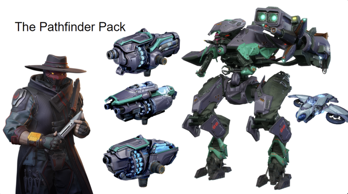
We started releasing robots with a set of guns, then after some time we rebuilt our entire content plan so that a robot would be released with everything it might need. As a result, now, as part of an event, a player can assemble a robot with a set of guns, a pilot, a skin, and a drone.
Brief conclusions on structure
The examples represent just some of the decisions we’ve made. Over the years, we’ve accumulated experience in content layers, in balancing and changing the meta – you can’t list everything. But let’s try to sum it up briefly.
Over many years, we’ve been building a content release structure so that each item is in demand, is unique, and has a specific purpose. This means that we now have a clear understanding of the content plan for the year ahead. We can not only avoid failures in terms of selling content, but we can also calculate the necessary resources in advance. This is a very effective and useful way of doing things for our project.
Gameplay design for gameplay’s sake
I already mentioned the example with the Bulwark robot above. To elaborate: this robot was created at a time when we were mostly focused on the image and visuals, rather than gameplay needs. At some point, the idea of an innovative robot that simultaneously combines two protection systems seemed quite intriguing.
Imagine this 20-meter armored colossus, which is armed with a pair of heavy cannons. This robot also carries an energy shield generator, which, when discharged, can be hidden, revealing physical shield plates, and after the energy shield is recharged, it can be activated again. The ideal robot tank, capable of withstanding any long battle. Slow, relentless fortress! Sounds cool, doesn’t it?
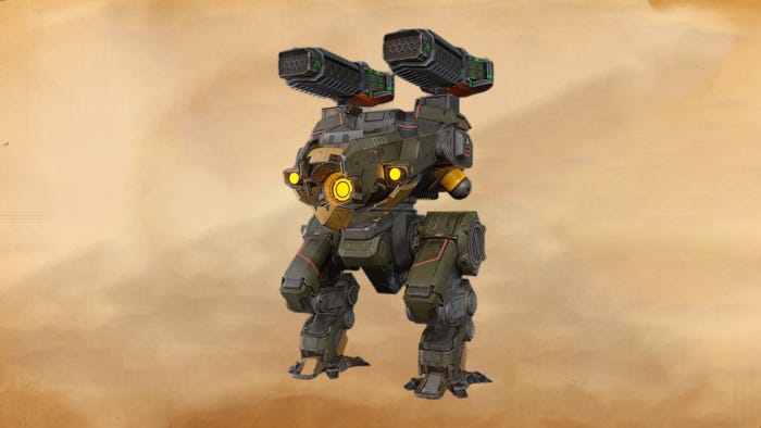
Griffin
In fact, when we began to classify the content, we discovered that Bulwark was perceived (and played) as a Sniper. Although its protection allowed it to hold out for a long time under enemy fire, its gun slots were designed more for long-range gameplay. The robot’s slowness only supported this idea: by the time it got to the hot spot, the battle was usually over.
That being said, we’re not suggesting that this robot turned out to be unsuccessful or wasn’t popular among the players; it certainly found an audience and carved out its niche. But could it have been better? Of course, if it had been initially designed based on the synergy of image and gameplay, not just on image.
Currently, our approach to content design is gameplay-first. So, if we’re making a robot of a certain class, we keep in mind the characteristics of the class and the characteristics of the current meta. On one hand, this complicates the work of the game designer, because these are additional restrictions. On the other hand, it creates an interesting challenge and guarantees us that when we release the robot, it will occupy exactly the niche that we initially wanted it to have.
Basic rules of gameplay design
We worked out some basic rules of gameplay design over the 10 years of War Robots’ life – and we follow them to this day. Although they reflect our experience and path, they can easily be scaled to any project, so these will be useful to every developer. Let’s look at them all.
The player must understand how the content works after getting acquainted with it for the first time. They may skip reading the guide and description and may not understand the details of the robot’s mechanics, but they should understand the basics without instructions. Our rule is: “If a player uses your content and understands what they are doing without reading the instructions first, congratulations! You did everything well.”
A good example of a complex but understandable robot is Ares. Even if the player is using it for the first time, the basic principle of its ability is clear. After the first use of its ability, the player will see a strange energy shield activate, and this will clearly indicate additional protection. Then, at the end of the shield’s effect, they will see how the robot fires a salvo from its built-in weapons.
It doesn’t matter if the player doesn’t immediately understand that the shield converts damage received into additional damage for the built-in cannon. The main meaning is conveyed: the robot has a shield, after its effect ends, the robot charges another attack.
Everything must have visualization. Nothing should happen without a clear signal that it is happening. Here, we resort to FX or animations and a clear UI. Ideally, the player should receive feedback both in the world and in the interface to ensure that they understand the content.
A good example of high-quality visualization is the Lock Down status effect. We display yellow electrical flashes on the robot’s legs, which look like something hampering the movement, and there is also an indication in the UI in the form of an effect status icon.
The player must be able to predict things. Good content should successfully use foreshadowing, and the player should be able to predict what might happen in the near future.
We always keep in mind that we’re making two-sided content: content will be played with, and that will be played against.
A good example is our visualization of enemy crosshairs and status. By targeting an enemy behind a wall, you receive information about the type of shields, additional protection, and you can even guess what kind of robot is about to come out against you. Even the behavior of a robot like Scorpion, which teleports behind the enemy’s back, can be predicted by a player who can’t see it from behind a wall — this is all thanks to the status effects displayed in the crosshair.
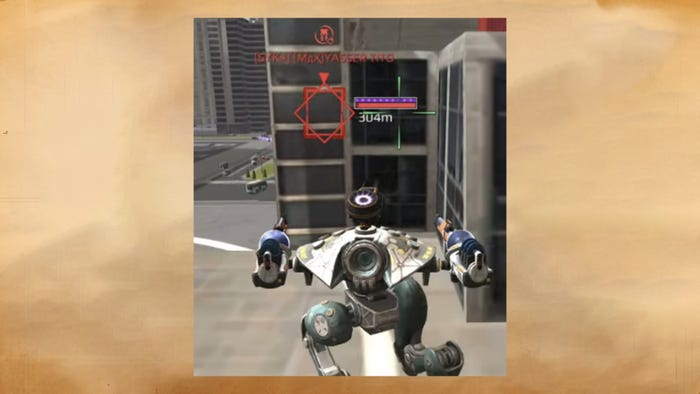
Another example of how a player can predict enemy behavior based on the UI. In this case, the Phantom robot sees the enemy behind the wall. It doesn’t know who exactly this enemy is, but it clearly understands that it has the status effect + his Absorber protective system is active. Based on this data, the player can understand that the enemy robot is now well protected, but this protection quickly subsides. You need to wait a few seconds and then initiate the battle
Conciseness is the key to clarity. Content should be easy to explain. Our rule says: “If your content requires a long explanation, and when doing so you mention many variables, then this content will also be difficult for the player to understand.”
An example of good and concise content is again the Ares robot. If we break down its ability step by step, we get the following: (Step 1) Ares activates an impenetrable shield; (Step 2) it then fires from the built-in weapon; (Step 3) the damage absorbed by the shield partially enhances the built-in weapon. Just like that, a brief and clear explanation.
Everything should have clear rules. Content should be predictable. Players generally don’t have a very good perception of the odds of something happening. In a game you want to control events, and if something depends on chance, it violates expectations.
Here, let me give a negative example. Our first guns with the Lock Down status effect (or as we simply call it, “root”) were implemented through chance. Each hit on an enemy had a chance to inflict a negative status effect. This was inconvenient, both for those who used these guns (you cannot predict whether you will be able to stop the enemy or not), and for those against whom they were used (there is always a chance that you will be unlucky and the effect will work on the first hit). As a result, we reworked the status effect system and made it cumulative: hit X times and the effect is guaranteed to work.
Everything must have a counterplay. Nobody likes content that cannot be defeated. You always need to create a weak point in the robot that a knowing user will be able to use to outplay the opponent.
A good example of a robot with a solid counterplay is the aforementioned Ares; its shield does not allow direct damage from outside, but at the same time, it allows AOE damage and the damage from the enemies who can easily get under it – and then Ares will be completely vulnerable.
These are the basic rules that we follow when designing content in War Robots. Whatever robot we create, its basic design must always take them into account.
***
We’ve reached the end of this article, but not the War Robots story. Over these 10 years, our project has changed many times, in terms of approach, rules, practices, tools. Using the example of robots alone, I tried to show how we have built our work with content over the years. But in addition to robots, we also have other layers of content, and other directions. But more on all this later! In the meantime, I hope you can take away something new and useful from our experience.
>>> Read full article>>>
Copyright for syndicated content belongs to the linked Source : Game Developer – https://www.gamedeveloper.com/design/how-to-design-giant-robots-in-shooters-a-comprehensive-war-robots-retrospective


