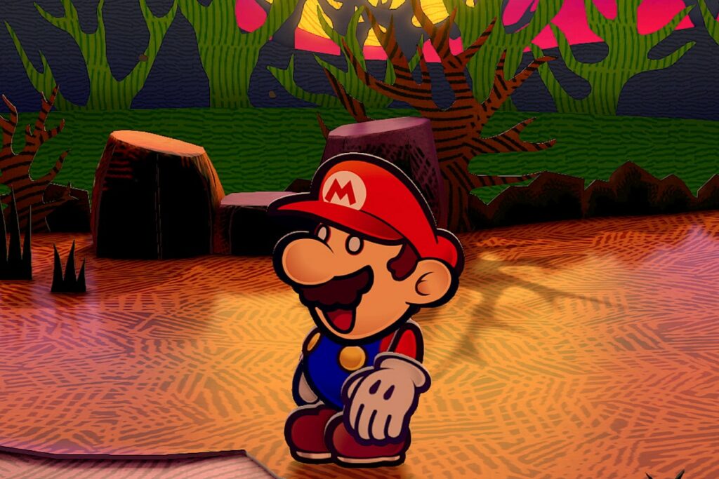
In the original, Mario and his friends are flat planes with black outlines, to give the impression they’re drawings rather than computer graphics. While that design is still present in the remake, you can also see a faint hint of a white highlight around the edges of the character model, much like you’d see on actual paper cutouts. It’s subtle but pervasive, and it contributes to the sense that these models really were cut out by hand.
Every piece of the world has this attention to detail. When you first enter Rogueport, there’s a platform in the main square with a noose on it. In the original, the wooden steps are straight and flat, and everything is at a right angle. It’s fine for a background element, and the flat noose cutout sways in the wind, so the effect works.
In the remake, however, the steps are a little crooked and janky. The side pieces of the steps look bent, like a child accidentally forced it too hard while slotting in the step pieces. It’s standing, but only barely. A mild gust of wind might blow the whole thing over. It might seem unimportant, but details like this make it easy to get drawn into Paper Mario’s world.
This is one situation where the improved graphics of a more modern console augmented the design choices from the original game. Switch graphics might mean Mario and his pals can look more realistic, but in this case that just means they look more handmade, like a paper craft model of the Mario from Super Mario 64.
The rich detail that the remake adds—with more complex models, better lighting and reflection systems, and higher resolution textures—makes the illusion so much more immersive and delightful. It’s apparent in every new setting how much effort was put into re-creating every aspect of the game.
Quality-of-Life Upgrades
Faithful re-creation isn’t always the most ideal way to approach a remake, and thankfully Nintendo agrees. This new version of The Thousand-Year Door comes with a few features that aren’t present in the original but would’ve been welcome additions.
The most useful of these, in my opinion, is the Partner Ring. In the original game, you had to open up a menu to swap between different members of your party. It wasn’t difficult per se, but it was tedious. In the remake, you can hold L and tilt the control stick to rapidly swap partners. It’s a shortcut that doesn’t fundamentally alter the game, but is a welcome convenience.
Similarly, there’s a new option when you fail a battle. Previously, if you lost a fight, you would have to reload from the last time you saved, which could sometimes be annoyingly far from where you were. In the remake, when you lose, you’ll see a new “Try again” option that will bring you back on the most recent section of the map, cutting down on huge amounts of tedious backtracking.
>>> Read full article>>>
Copyright for syndicated content belongs to the linked Source : Wired – https://www.wired.com/story/paper-mario-the-thousand-year-door-sets-the-standard-for-classic-game-remakes/
