Believe it or not, Crusha was first introduced in 1955, when Bill Haley & His Comets enjoyed the top spot in the UK singles chart for their hit, Rock Around The Clock. It’s a sign of the times: American culture was cool in post-war Britain, and consumers wanted a taste of the United States, which was booming back then.
Consumerism was taking off in a big way. The first McDonald’s opened that year, and millions of cars were sold. Rock and Roll music was incredibly popular, with Elvis Presley and Chuck Berry on every jukebox in every diner and Marilyn Monroe, an international icon. Life felt good, and teenagers on both sides of the pond enjoyed more freedom than their parents had during the World Wars. Crusha was a part of all that, tapping into a global mood of optimism and hope.
Not long after its launch, British Sugar bought it to sell a range of milkshake mix flavours to the UK market. In late 2001, it came under its brand, The Silver Spoon Company—one that still thrives today.
But while Crusha has survived almost 70 decades, appealing to every generation of children with its range of flavours, from strawberry and vanilla to raspberry and banana, it felt a brand refresh was in order to feel more modern. It collaborated with Bristol-based design studio Outlaw to reimagine its brand and hopefully reach a much bigger and broader audience.
Therefore, Outlaw’s challenge was to examine Crusha’s key brand assets more closely and aim to restore the exciting, irreverent, and distinctive personality that consumers unmistakably recognise as Crusha.
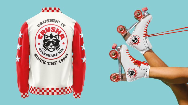
How did they achieve this? By tapping into its 1950s heritage and fully embracing the world of American diners as inspiration. We’re talking about the epicentres of youthfulness and rebellion throughout pop culture, from Grease to Pulp Fiction. As such, the new design takes the visual cues of “proper” diner milkshakes, including striped straws, tall glasses and thick, creamy, frothy shakes.
Visual elements, like the checkerboard pattern, ground the design in that classic diner aesthetic and really hit home that Crusha is the authentic, original milkshake syrup – “the only choice when it comes to a real at-home milkshake experience,” says Outlaw.
As for the brand’s original mascot, Errol – the irreverent cat – Outlaw felt he’d become “too soft, infantile and playful” in recent years and needed to appeal to a broader audience. So the Bristol studio enlisted the help of local illustrator Yee Poon to bring the furry character to life again, unleashing the original Errol attitude (we’re presuming that means ‘cool cat’) and placing him centre-stage within the main Crusha brand.
“Our new design channels the irreverent attitude of Errol the cat, who was the heart and soul of the original advertising,” says Alex Rexworthy, design director at Outlaw. “Drawing inspiration from classic milkshakes mixed with Americana, our design promises joy to the very last slurp.”
This isn’t the first time Outlaw has worked with Silver Spoon, the UK’s leading sugar brand. It also helped refresh its Silver Spoon range, from its icing sugar and granulated sugar to its dark brown sugar and more home baking products.
>>> Read full article>>>
Copyright for syndicated content belongs to the linked Source : CreativeBoom – https://www.creativeboom.com/inspiration/crushas-new-identity-is-a-mashup-of-american-diners-grease-and-teenage-rebellion/
