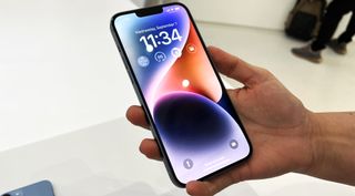
The iPhone 14 Plus
(Image credit: Future)
Generally software updates lead to improvements, but when it comes to iOS 17, at least one aspect of the best iPhones might be changing for the worse. It looks like the layout of the call screen buttons will be changing, and we’re not fans of where they’ve ended up.
This change has been spotted in the latest iOS 17 beta by the likes of Tom’s Guide and others, and it sees the end call button move from a fairly centered position – separate from the other call screen options – to a bottom-right position, right next to everything else.
All the other buttons have also been shifted lower down, and most of them have been swapped around, while the ‘add call’ and ‘contacts’ options from iOS 16 have been combined into one.
Apple is changing where the end call button is and we already hate it iOS 16 iOS 17 pic.twitter.com/v6qLXCuMZoAugust 9, 2023
See more
There is some logic to, at least, some of these changes. Moving the icons further down the screen makes them more reachable with one hand, which could be especially useful if you’re using something big like an iPhone 14 Pro Max, or if you have small hands.
But it’s a change that also makes an enemy of your muscle memory, with nothing being where you’d expect it to be anymore, and it’s not at all clear why various options such as the keypad and FaceTime have swapped places.
This could easily lead to the wrong buttons being accidentally pressed, or at the very least will mean it takes longer to find some options until you get used to the changes.
Bad news for left-handers
But there’s another problem too. While the end call button’s new position will make it easier for right-handed users to reach, it’ll likely be harder for left-handed users to access, where before it shouldn’t have been too much of a stretch for anyone.
Having the end call button separate from the other icons as it is on iOS 16 also makes a certain amount of sense, since it’s the button you’ll most often be using, and this way it’s more distinct than in its position in iOS 17 – though as it’s colored red, it should still be pretty easy to spot regardless (color blindness notwithstanding).
Of course, this is all a bit subjective, and some people – especially some right-handed people – will probably be happy with at least some of these changes, but early reactions are certainly divisive.
The one thing to note though is that since iOS 17 is still in beta, it’s possible that these changes won’t make the cut for the finished release, especially if the feedback is negative enough. We’ll probably find out in mid-September, as that’s when iOS 17 is expected to land.
Sign up to receive daily breaking news, reviews, opinion, analysis, deals and more from the world of tech.
James is a freelance phones, tablets and wearables writer and sub-editor at TechRadar. He has a love for everything ‘smart’, from watches to lights, and can often be found arguing with AI assistants or drowning in the latest apps. James also contributes to 3G.co.uk, 4G.co.uk and 5G.co.uk and has written for T3, Digital Camera World, Clarity Media and others, with work on the web, in print and on TV.
>>> Read full article>>>
Copyright for syndicated content belongs to the linked Source : TechRadar – https://www.techradar.com/phones/iphone/apple-has-changed-how-you-end-calls-on-ios-17-and-we-hate-it
