I make no secret that the iPhone is one of my favorite gadgets. It is, without a doubt, the device I use the most. My iPhone is in use all the time — and if it’s not in my hand or pocket, it’s never further than an arm’s length away.
Overall, I have very few complaints about my iPhone 15. Even my long-time bugbear with Apple device’s, battery life, has improved to the point that I rarely have to think about it. So much so that to preserve the longevity of my battery, I only charge my iPhone to 80% every day. Even that reduced charge gets me a full day’s use.
Also: Why I limit my iPhone 15’s charge capacity to 80% (and you should, too)
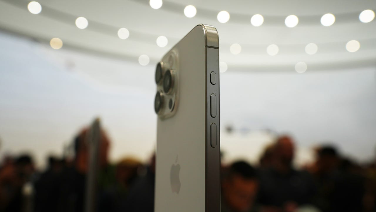
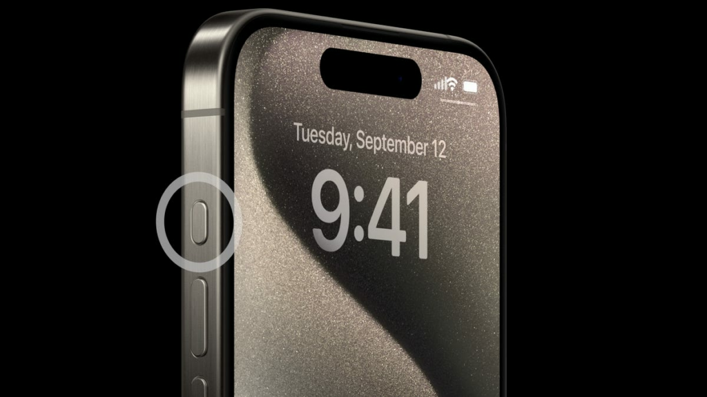
But I detest one feature Apple introduced with the iPhone 15– the Action Button on the side. I don’t understand the logic behind this button. At a time when Apple is stripping buttons and ports out of devices to simplify them (and simplify the production line, which in turn boosts profits), it’s strange that users have gained a new button.
The origin of this button is pretty easy to trace and goes back to the Apple Watch Ultra. On the face of it, a button that can be configured to carry out a specific action sounds like a good idea. On the Apple Watch, this button is a reasonable idea because you’re dealing with a device with limited screen real estate for on-screen buttons.
Also: 5 rumored iOS 18 features I’m most excited about – and AI is just the start
But on the iPhone, this button feels strangely superfluous. Initially, I thought it would be a cool idea to set the button up to activate the flashlight. Yes, a button on the screen allows you to turn the flashlight on, even if the phone is locked, but I thought I’d like a physical button.
Well, I’ve lost count of the number of times that the flashlight has accidentally activated itself while the phone was in my pocket or bag. Despite requiring a double press, it’s easy to activate.
While it’s frustrating to walk around with a flashlight switched on in your pocket, having it accidentally activate the camera and take hundreds of photos of the inside of your pocket is even more annoying. When I set the Action Button to do something less demonstrative — activate silent mode or do not disturb, for example — my phone is regularly silenced or set to do not disturb mode because of accidental activation.
Also: iPhone 16 reports: Spatial video and ultra thin bezels coming to all models
Try as I might to love the Action Button, I can’t get to grips with it. The more I speak to other iPhone users, the more I hear the same thing. It’s a good idea, but it’s been badly implemented.
I gave up, set the button to do nothing, and, much like the human appendix, it’s now a vestigial organ. But at least it can’t cause chaos.
You can change what the button does. And thankfully, you can also turn it off.
June Wan/ZDNET
So, why did the Action Button need to exist in the first place? I’ve spoken to several people, inside and outside of Apple, and I’m unclear. Was the button a genuine attempt to add a useful feature to the iPhone, one of those features that lost meaning as the iPhone 15 project moved on? Or was it just a cheap and simple way to make the new iPhone visually different from the old device?
While Apple has been pushing all the cool artificial intelligence features it plans to roll into the iPhone 16, along with the inevitable processor and camera improvements that we’ve come to expect yearly, I hope the engineers at Apple have figured out a way to make this feature more user-friendly.
Also: How Apple’s AI advances could make or break the iPhone 16
Of course, they could remove it altogether, because I’m not sure why, in an age where we’re used to touchscreens and voice activation and all that good stuff, we need to have yet another button.
Just make Siri better and the argument for an extra button becomes moot.
>>> Read full article>>>
Copyright for syndicated content belongs to the linked Source : ZDNet – https://www.zdnet.com/article/apple-needs-to-fix-this-crazy-iphone-annoyance/#ftag=RSSbaffb68
