The king was on his last legs – Symbian once ruled the smartphone world, but the introduction of the iPhone followed by the arrival of Android spelled the end for the platform. However, it would not go gentle into that good night.
Symbian is the core of the OS and there were several user interfaces built on top of it. Series 60 is perhaps the best-known among them – it made its debut with the Nokia 7650, which was not only Nokia’s first camera phone, but also the first mass-market Symbian phone (there were some niche phones before it).
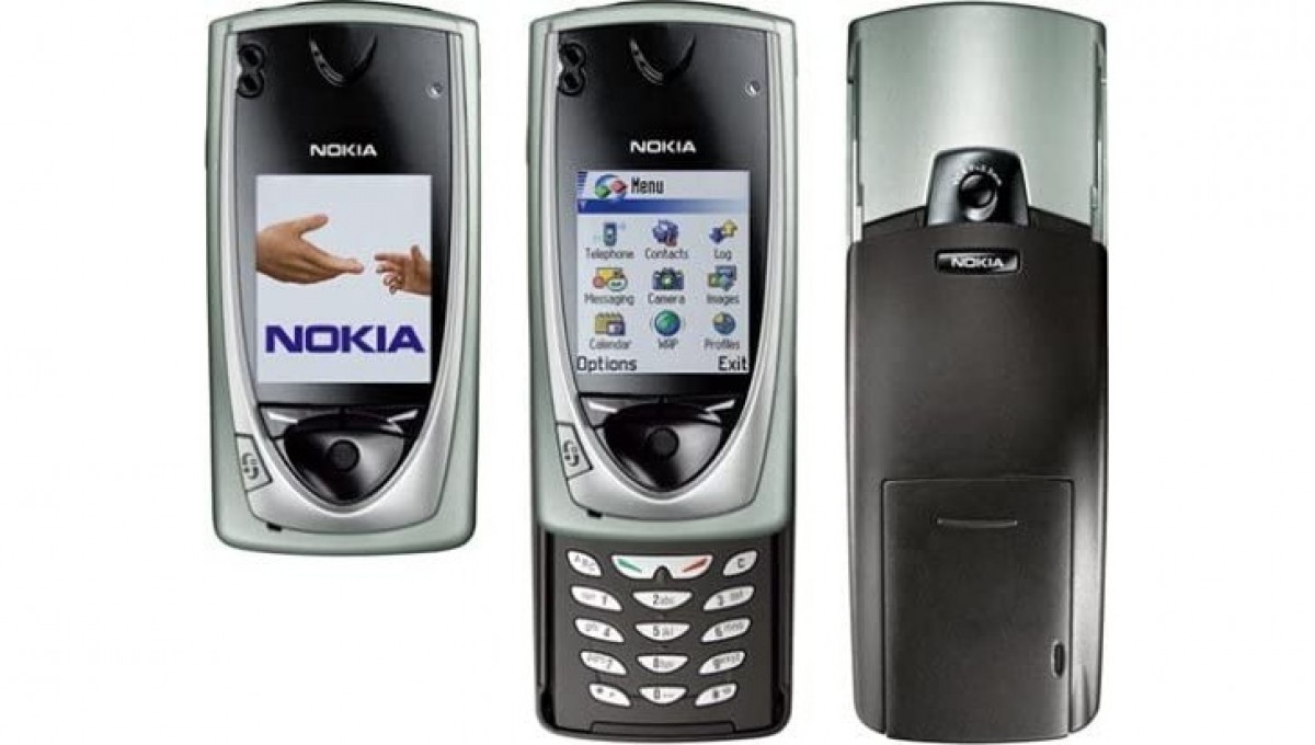
Nokia 7650, the first mass-market Symbian phone
For the most part, Series 60 ran on phones with a display between 2 and 3 inches. The UI was built around a D-pad, which was used to navigate between elements on the screen, and several smart buttons, which triggered context-sensitive actions.
There was also the Series 80, used in QWERTY-packing Communicator phones from Nokia, but the Finns primarily used S60. None of those Communicators had a touch display, anyway.
There was also Symbian UIQ, which was built for PDA-style devices. We revisited that branch of Symbian back in our Sony Ericsson P910 Flashback. UIQ was designed for touchscreens – resistive touchscreens that were intended to be used with a pointed stylus more so than a finger (a finger, especially a fingernail, worked most of the time, though).
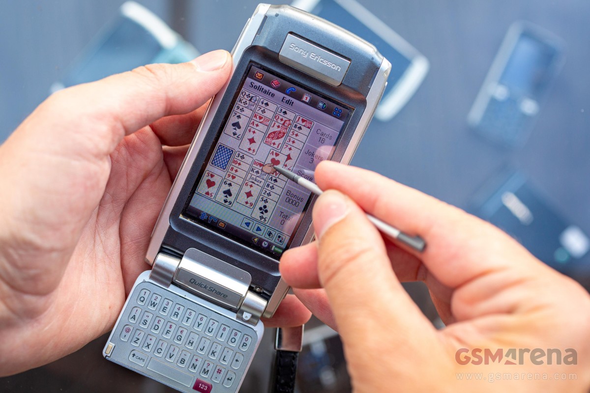
Sony Ericsson P910
Fast forward to 2008 and we get to Symbian Series 60 5th edition or as it was later called, Symbian^1. This one was a Symbian UI built for touch, but instead of drawing inspiration from the now-dead PDAs like UIQ did, 3rd edition cribbed from the iPhone. We’ve already discussed the reasons why it failed in our Nokia 5800 retrospective – bolting touch on top of a D-pad based UI just didn’t work.
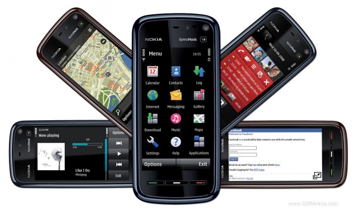
The Nokia 5800 XpressMusic was a major push towards touch UI – a failed one
Today we want to focus on what came next, Symbian Anna, which arrived a year after the launch of Symbian^3 (Symbian^2 launched only in Japan). Anna was unveiled in early 2011 alongside the Nokia X7 and Nokia E6. The E6 was a bar phone with a QWERTY keyboard (and a 2.45″ touch display), but the X7 was all touch (4.0″ display).
Even better, owners of certain older Nokias would receive Anna as an update, that was the case for the Nokia N8 and E7. The Nokia C7 and C6-01 got it too.
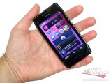
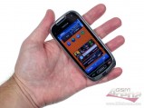
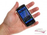
Nokia E6 • Nokia X7 • Nokia C7 • Nokia C6-01
We updated our Nokia C7 review to cover all the new features – let’s go over them together. Honestly, this feels more like rediscovering the limitations of older Symbian instead. Was it really that bad? Yes, it was.
Perhaps the two biggest upgrades that came with Anna over ^3 were the new keyboard and the new browser. “That’s it?” you may be thinking. Well, a picture is worth a thousand words, so here it goes: the portrait keyboard of Symbian^3 is on the left, the one from Anna is on the right.
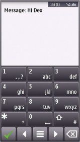

Portrait keyboard: Symbian^3 • Symbian Anna
In case it still isn’t clear, what you’re seeing on the left isn’t an app that is sharing the screen with the keyboard. No, this is the text input interface – it covered the whole screen and showed a panel for text and the keyboard underneath. In contrast, Anna’s keyboard (like any sane OS today) just appeared on the bottom half of the screen, obscuring part of the app but also leaving the other part visible.
And yes, the only portrait option in ^3 was a virtual T9 keyboard. If you wanted QWERTY, you had to go in landscape mode.
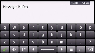
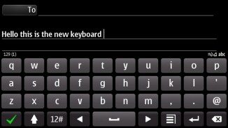
Landscape keyboard: Symbian^3 • Symbian Anna.
This is what we mean by touch features being bolted on top of a non-touch OS. The text input interface made sense when phones had 2.6” displays with 240 x 320px resolution, it just wasn’t worth it to split such a screen between text and app.
It was worse than it might seem too, since multi-touch wasn’t supported meaning that you couldn’t hit multiple keys even on the full QWERTY keyboard in landscape mode – and if you type with any sort of speed, you would do just that. Multi-touch wasn’t available in Anna either.
As mentioned earlier, the other big upgrade was the browser. In the early days of mobile Internet there was this thing called WAP, which was very limited. Eventually as screens got better, CPUs got faster, RAM increased and mobile data got quicker, phones ventured into the true World Wide Web, the one that PCs were browsing. But this required a new generation of browser to get the full experience.
The browser UI was redesigned to leave as much of the screen to the page – the status bar/URL field were on top, there was a back button in the bottom left corner and a menu button in the bottom right. Speaking of URLs, you could type one in without a silly text input UI covering up your whole screen.
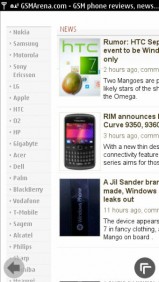
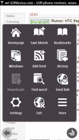
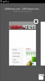
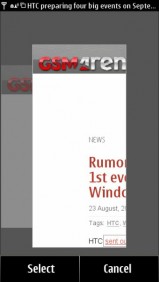
The much-improved Symbian browser
Tabs were supported as were new web technologies like HTML5. Flash still wasn’t quite there – the Symbian browser could only do Flash Lite 4. This pretty much excluded playing Flash games and watching YouTube videos in the browser (you had to use the app).
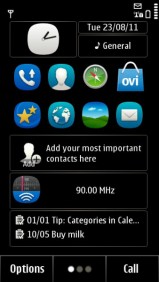
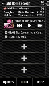
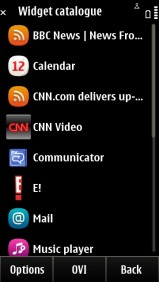
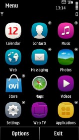
The Symbian Anna homescreen
There were other improvements too. For example, Symbian had supported home screen widgets for a while at this point, even multiple home screens. However, navigating between them wasn’t as fluid as on Android – you would swipe to the side, then the sliding animation would play out. With Anna (like on Android), the homescreen would immediately follow your finger.
Nokia also polished the email app, the calendar app and the Ovi Maps app. It changed the icons to the still-popular squircle shape too.
Things were looking good – well, looking better – but Anna was still well behind Android. Former Symbian users like Sony Ericsson and Motorola had switched over to Android, it was just Nokia that kept the old OS going. The Finnish giant had even more improvements in the pipeline, however, those wouldn’t be enough either.
Do you remember Symbian Anna – and is it a good memory or a bad one? We will have a closer look at that followed it Symbian Belle next week.
>>> Read full article>>>
Copyright for syndicated content belongs to the linked Source : GSMArena.com – https://www.gsmarena.com/flashback_how_symbian_anna_tried_to_bring_an_old_os_into_the_modern_touchscreen_world-news-60535.php


