While Windows is best known as a desktop operating system, Microsoft’s big push with Windows 8 was to make both the internals and the user interface capable of running on a touch-based, ARM-powered device. This caused a massive rewrite of Windows Phone as it went from version 7 to version 8 and breaking app compatibility. The desktop and mobile OSes continued to move closer together and Windows 10 Mobile’s Continuum feature blurred the lines between desktop and mobile.
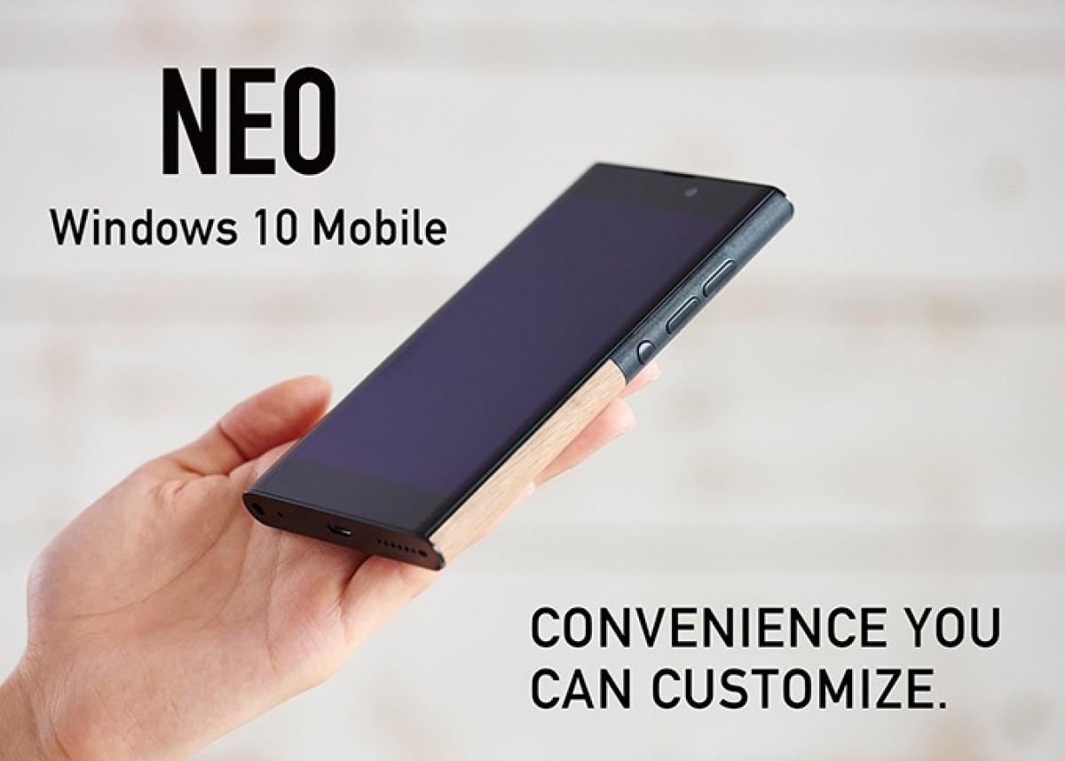
The hero of today’s story – well, the tragic hero, but let’s not spoil the story – is called the NuAns Neo. Continuum plays a big part in its story as it was one of the highlights in the Kickstarter campaign.
For those unfamiliar, Continuum was a desktop mode for Windows 10 Mobile. It could pipe video out through a USB-C port and could run mobile apps in windowed mode. Better yet, it could run Win32 apps, i.e. Windows applications written for 32-bit x86 processors (which was the majority of apps at the time).
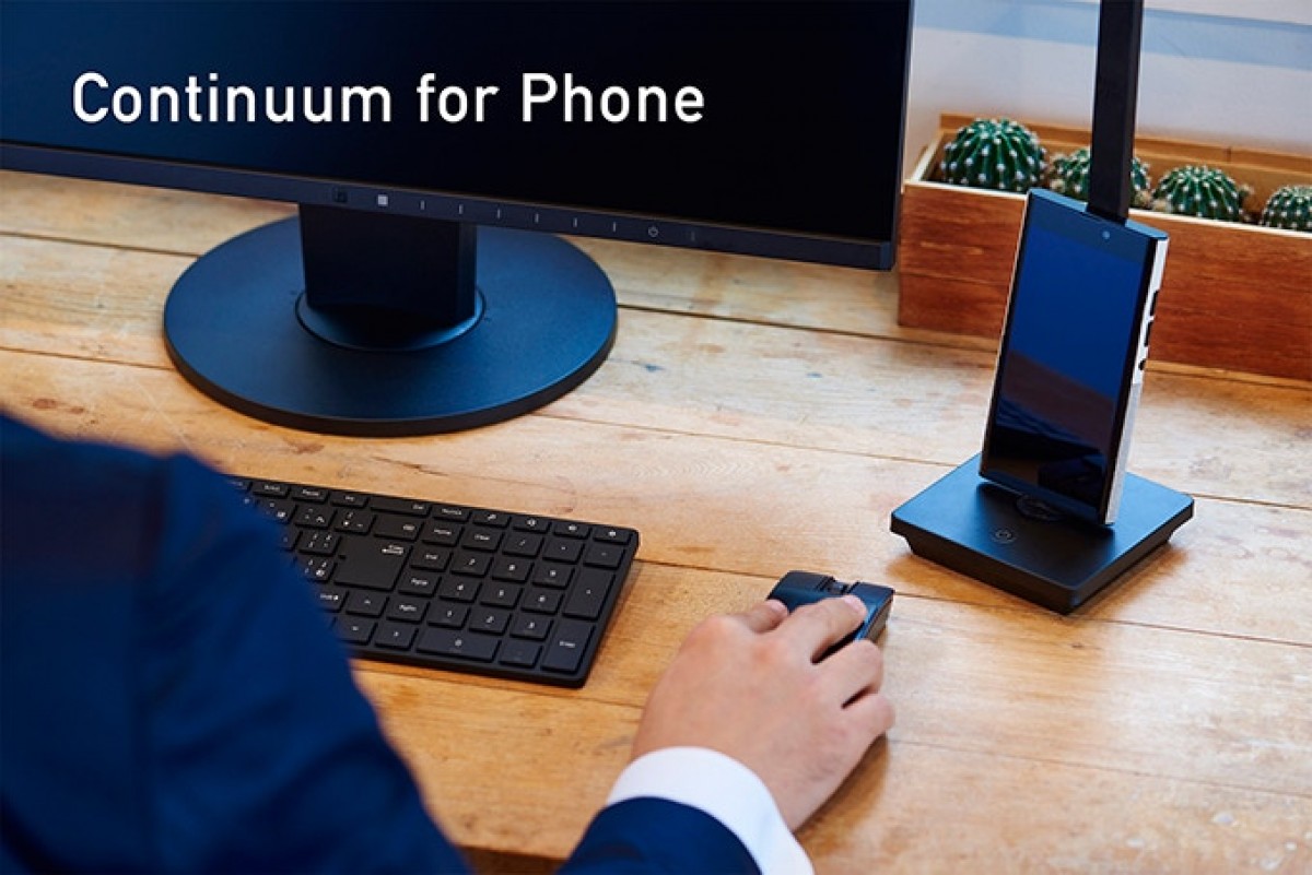
NuAns Neo running Continuum
We immediately encounter the problem with this plan. The Neo was powered by a Snapdragon 617, a 28nm chipset from late 2015 that featured an octa-core Cortex-A53 CPU (4+4, 1.5GHz + 1.2GHz configuration) and had an Adreno 405 GPU, plus a Cat. 7 LTE modem (300Mbps down/100Mbps up).
To say that is under-powered would be an understatement – NuAns wanted to launch the Neo in mid-2016, around the same time that ZTE unveiled the Zmax Pro, a $99 phone with the SD 617, 2GB of RAM and 32GB storage. For comparison, the Neo also had 2GB of RAM and just 16GB of internal storage (expandable with UHS-I microSD cards up to 128GB).
That’s very little computing power for a desktop replacement. For further context of the tech scene in 2016, you could pick up a Lumia 950 for just £250 and Microsoft would have thrown in a free Display Dock for use with the Continuum feature. A Lumia 950 XL was £340. Microsoft was handing out free Docks in the US and Canada too.
Admittedly, the Snapdragon 808 and 810 chipsets inside those phones were deeply flawed, but they were still miles better than the 617. And you got 3GB of RAM plus 32GB storage (expandable).
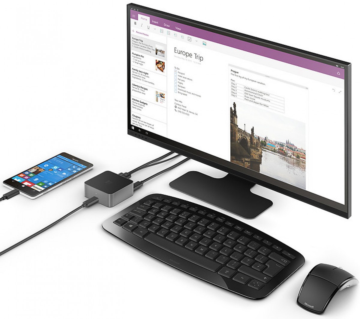
A Microsoft Lumia 950 with the Display Dock running Continuum
Okay, to be fair, at that time Microsoft was holding a fire sale of its Lumia inventory as it had lost confidence in its smartphone business. And the NuAns Neo wasn’t an expensive phone – its market value was listed as $400, but early bird backers could get it for $270.
Let’s look at the hardware – we’ll have more to say about the design later as that is by far the best feature on the phone. For now, let’s look at the hardware. There were the requisite USB-C port and 3.5mm headphone jack. The back was removable, as was the 3,350mAh battery, this also gave you access to the SIM and microSD slots.
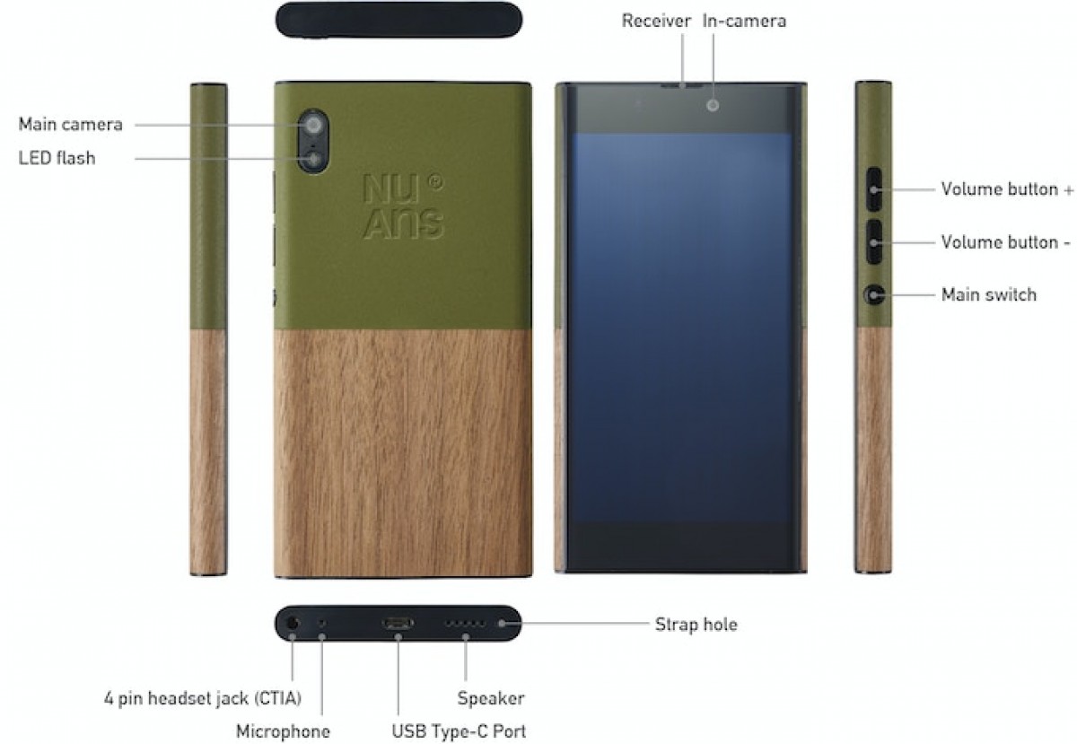
NuAns Neo overview
Interestingly, there was space for an NFC card under the rear panel. NFC was already well-established by 2016, but there is some merit to this approach – e.g. the iPhone 7 had it, but Apple only opened up access to it in 2018 with iOS 12. NuAns’ allowed you to use, say, a public transport card or a card that opens the door to your office, even though those may have used standards not supported by phones of the day.

The Neo had a 5” display with 720p resolution, which was low for a $400 (even $270) phone of the day. The Zmax Pro had a 6” 1080p display, by the way. There were two cameras on board – 13MP on the rear and 5MP on the front, both with autofocus. The phone measured 141 x 74.2 x 11.3mm and weighed 150g.
Alright, let’s talk about the design now. The rear panel was removable and there was a cool twist – there were actually two panels that could be changed individually. This allowed users to mix and match panels to get a unique look with so many possible combinations. Here are the panels available for the “TWOTONE” look:
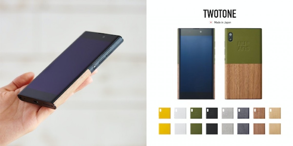
And now an animation to drive the point home. If you had several panels, you can have a different combo for each day of the week.
The NuAns team took care to pick great quality materials that offer a mix of wood, leather and suede. Those weren’t natural materials but instead designed specifically to handle the wear and tear of daily use.

As an alternative to the TWOTONE cases, there were wallet-style FLIP cases too. This covered the back with a single piece and wrapped leather around the front. A magnet held the case closed (and was used to lock/unlock the phone) and there was a small pocket for credit cards inside. Also, the case could be used as a kickstand.
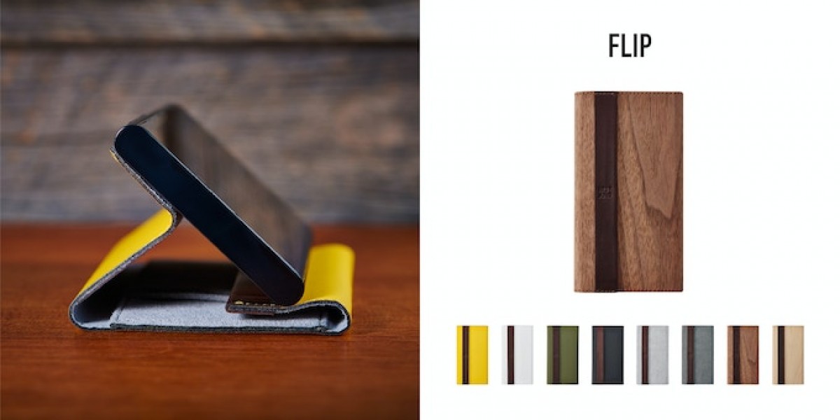
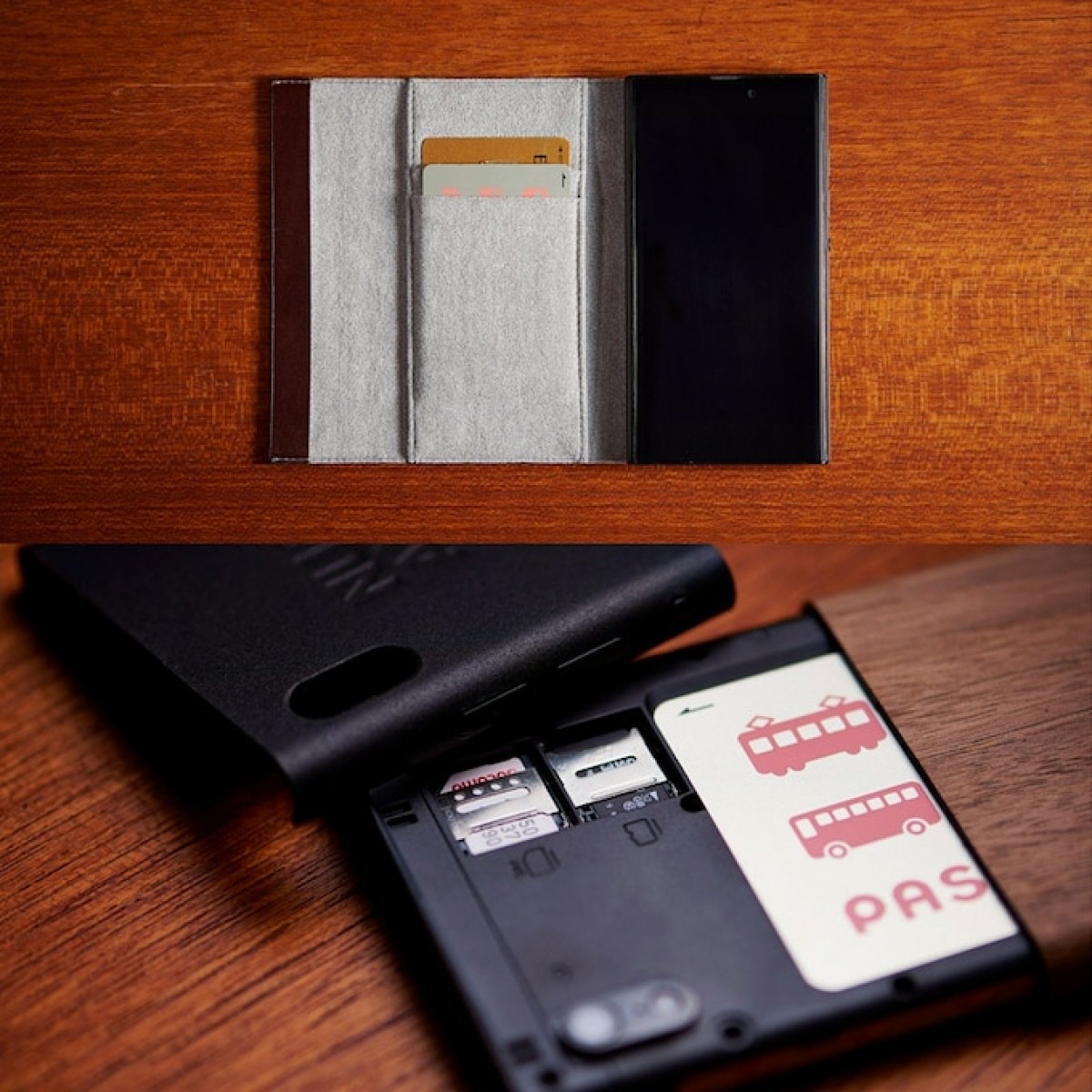
We don’t know about you, but we think that the NuAns team created some beautiful designs, though we question how wise it is to have a gap in the middle of the back. The Neo lacked water resistance of any kind, of course, but even just dust getting in could have been a problem.
We’re not the only one that think that the Neo is a looker, it won an iF Gold Award, here is what the panel of judges had to say:
This smartphone by Japanese manufacturer Trinity represents a departure from most products in its category, combining complex technology with interesting haptics. It has a fresh appearance through the use of wood and other ‘warm’ materials, and the curved body shape feels natural and well balanced. Overall, a superbly executed product.

By now you must be eager to find out what happened to the NuAns Neo. The phone was unveiled in Japan in late 2015 and then it was shown off at CES in early 2016. The plan was to launch it globally through a Kickstarter campaign in June 2016.
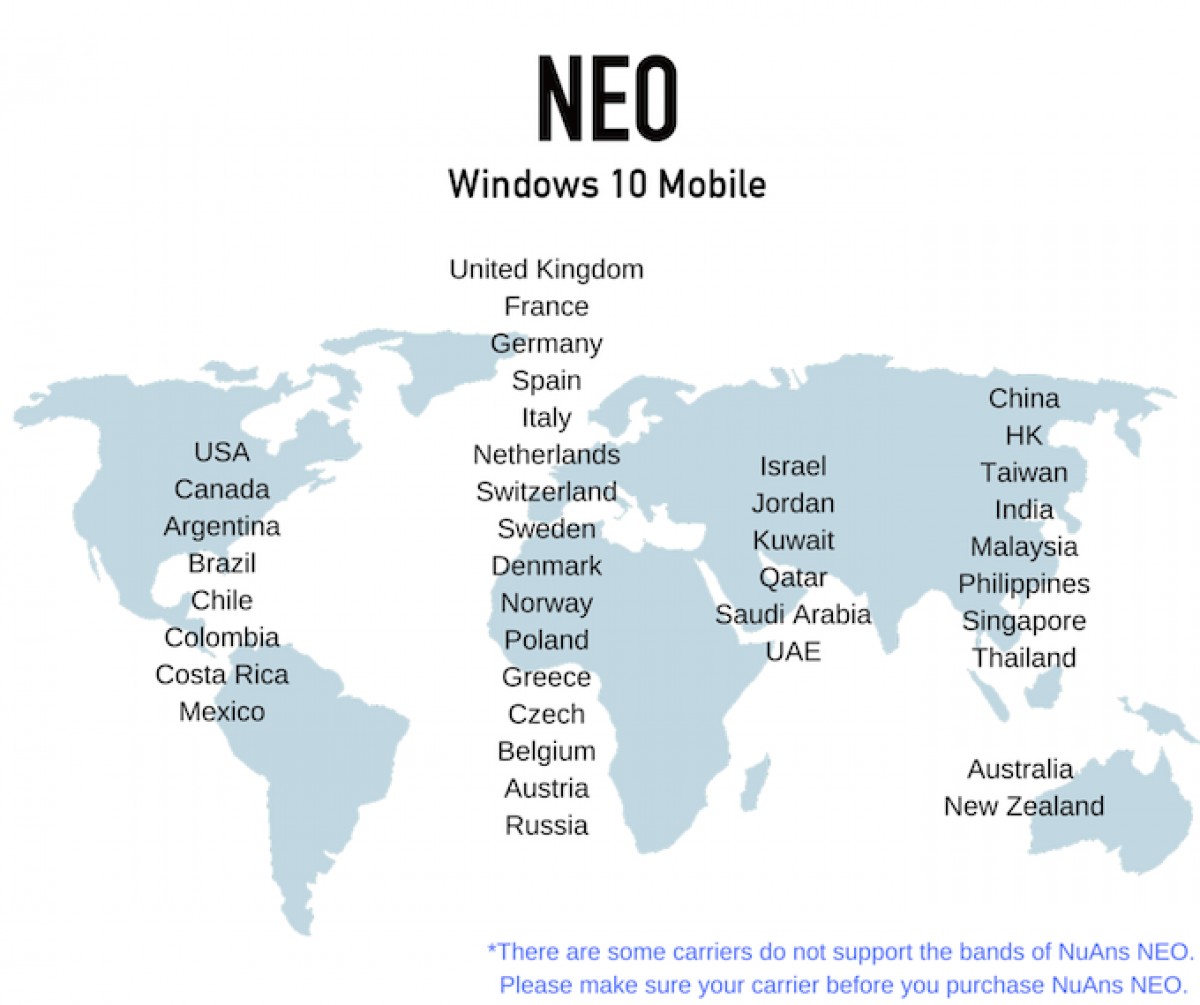
The Kickstarter campaign had a modest goal, $725,000, but it failed to garner any interest. Only 489 backers signed on with a monetary total of just $142,368. That’s better than Meizu’s port-less phone, though nowhere near what was necessary to bring the phone to the global market. It seems that the Neo was sold in Japan, but we can’t find any sales figures.
It would be a shame to waste such a beautiful design, right? The NuAns team thought so too and had another go at it – this time with Android 7.1 Nougat instead of Windows. The new model was dubbed the NuAns Neo Reloaded (apparently the team was a fan of the Matrix movies) and it was indeed a brand new model.

The Reloaded was beefed up with a Snapdragon 625 chipset, 3GB of RAM and the screen was upgraded to a 5.2” 1080p panel. This addressed all the key concerns about the original Neo. There were other updates too, like a fingerprint reader and Dragontrail Pro glass on the front.



The new and improved NuAns Neo Reloaded
The team even released CAD files to help people design and 3D print back covers for the Neo Reloaded at home, which was really cool of them.
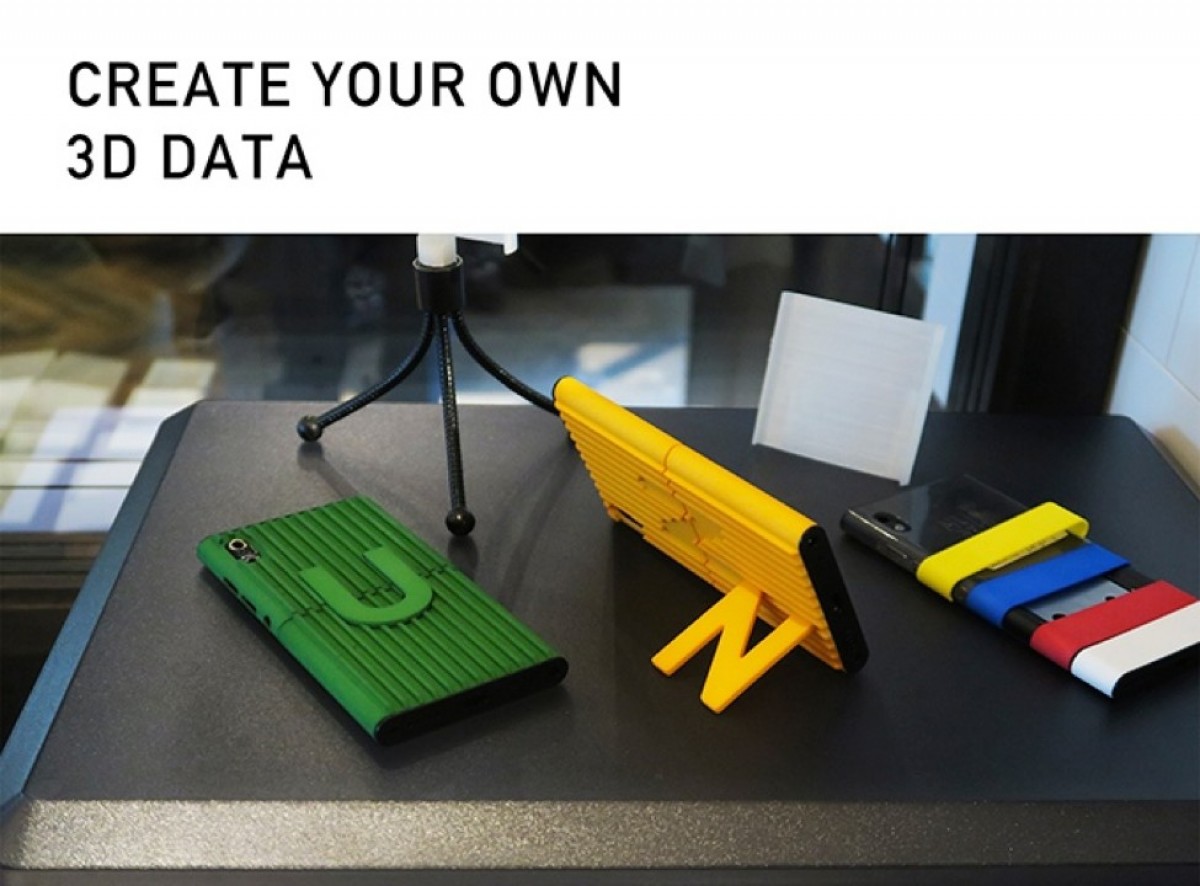
The phone was set for a May 31 2017 launch in Japan with a price tag of JPY 49,800 (around $440 at the time).
History repeated itself when NuAns attempted a global launch, this time through IndieGoGo. The campaign had an even lower goal, $370,000, but it drew even less interest with only 23 backers and $7,708 in the bag.
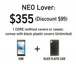
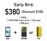

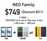
NuAns Neo Reloaded global pricing
We’re skeptical of post-PC designs at the best of times, but trying to position a phone with a Snapdragon 617 and 2 gigs of RAM as a desktop replacement is not even a good time, never mind best. Still, there’s no denying that the NuAns Neo was a bold design, a rare thing in the last decade.
Would it have been successful had it gone with Android from the get-go (and with a better chipset)? Android at the time wasn’t ready for desktop mode (Android today isn’t either, outside of vendor-exclusive implementations), so NuAns would have had to cut that feature.
That would still leave the beautiful, customizable design, but that alone may not have been enough. Moto Maker back in the day and Samsung’s Bespoke Edition phones today do offer some customization, though without the clever split design of NuAns. Those Moto X and G models and the current Galaxys started off with good hardware before focusing on the looks, however. When it comes to the NuAns Neo, beauty was only skin deep – the inside was a $100 phone.
>>> Read full article>>>
Copyright for syndicated content belongs to the linked Source : GSMArena.com – https://www.gsmarena.com/flashback_phones_that_werent_part_3_an_awardwinning_design_hobbled_by_an_awful_chipset-news-58924.php


